Que™ Integration - AI Wiz to build APIs, Processes & Maps

eQube®-DaaS Platform - Integration Suite
Digital thread through data federation Using eQube DaaS and Mendix
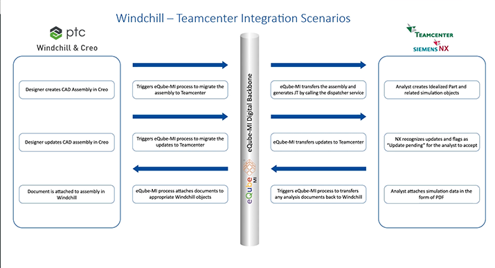
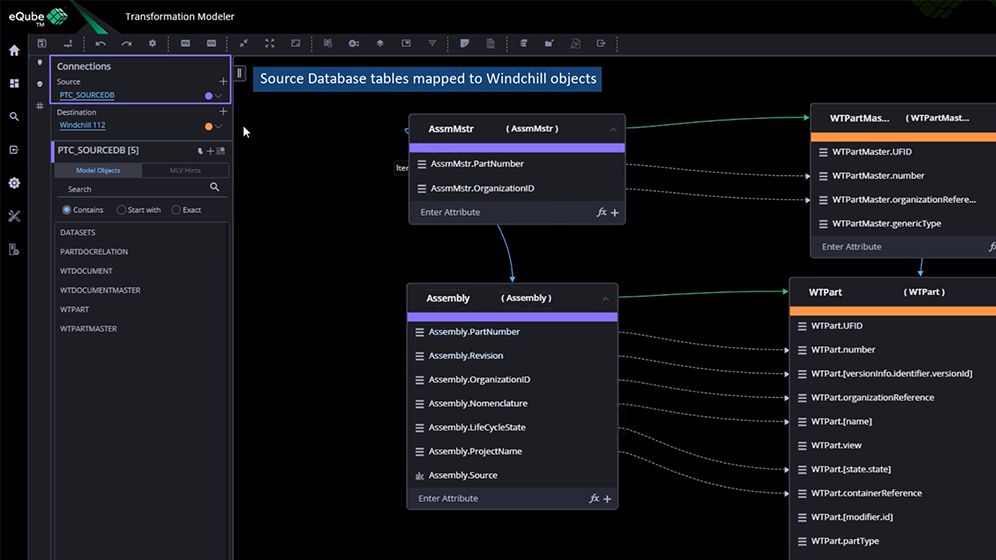
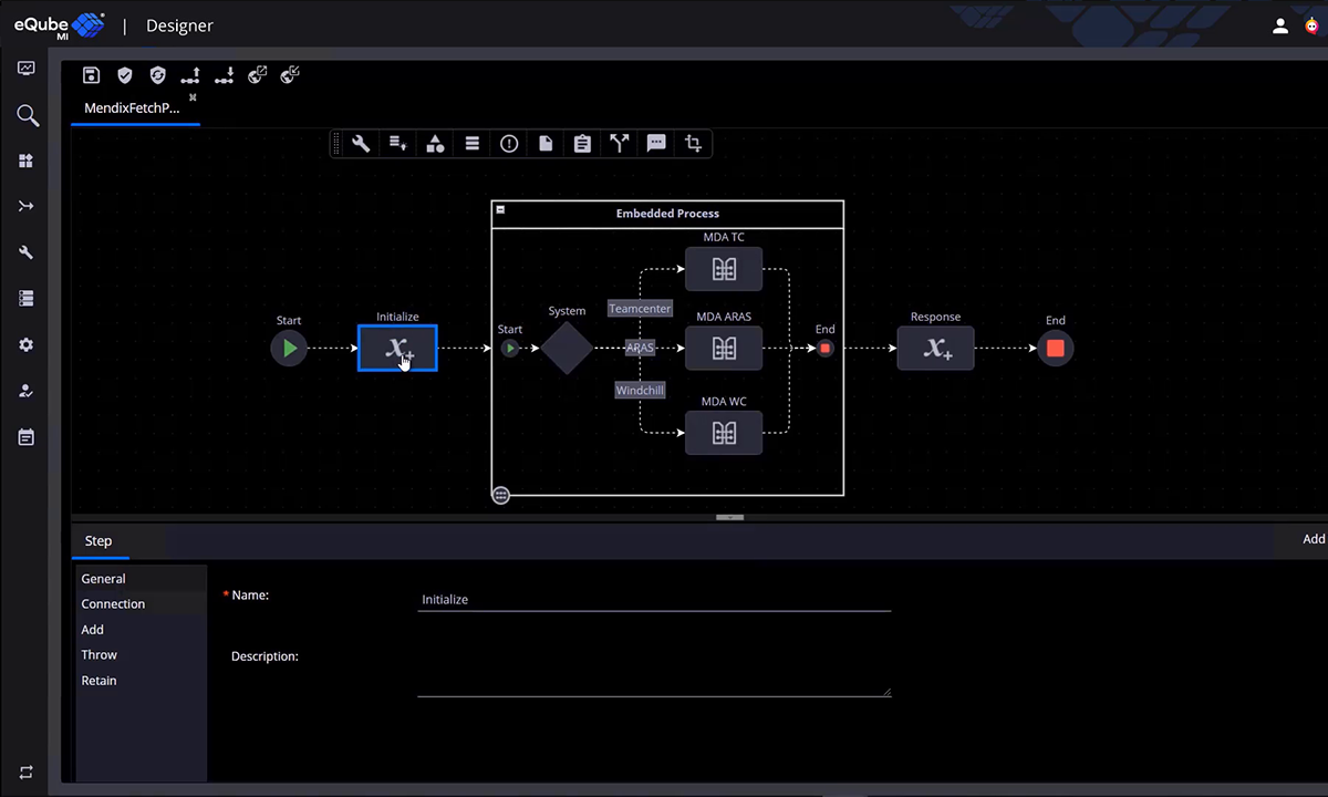
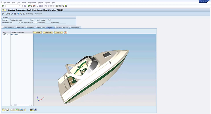
Windchill Teamcenter CAD Integration
eQ MBSE Firmware App using Mendix
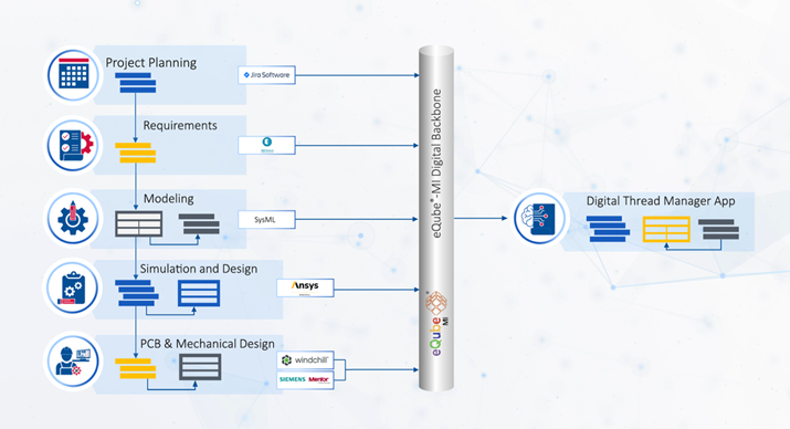
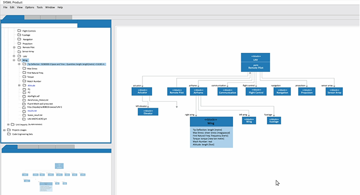
eQube® Digital Thread - MBSE
Enterprise Search App
NAVY Model Based Product Support
(MBPS) capability
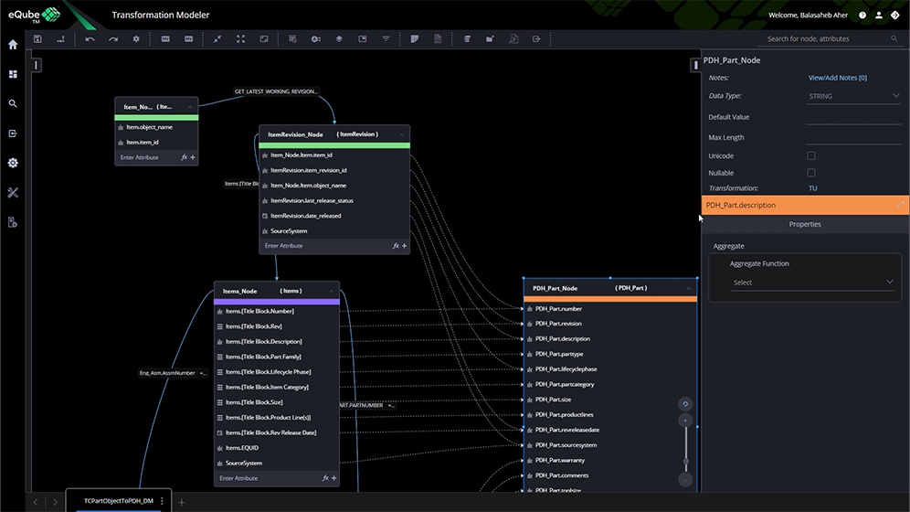
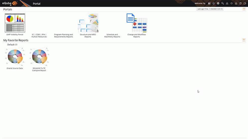
Building Product Data Hub
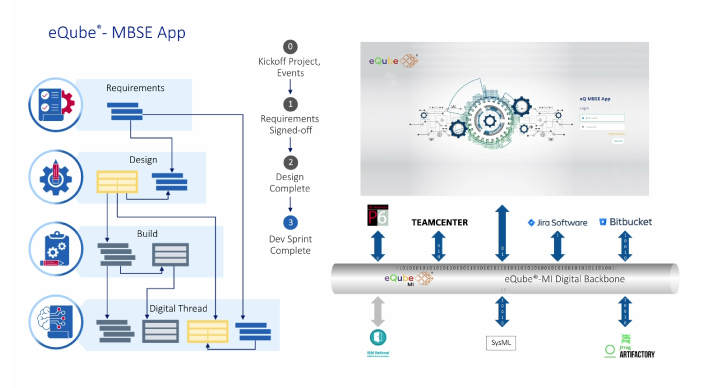
Firmware - Model Based Systems Engineering (MBSE)
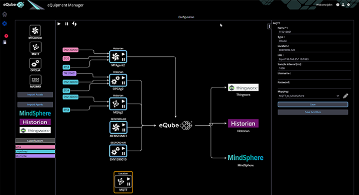
Realizing the promise of Smart Factory
'eQuipment Manager' app
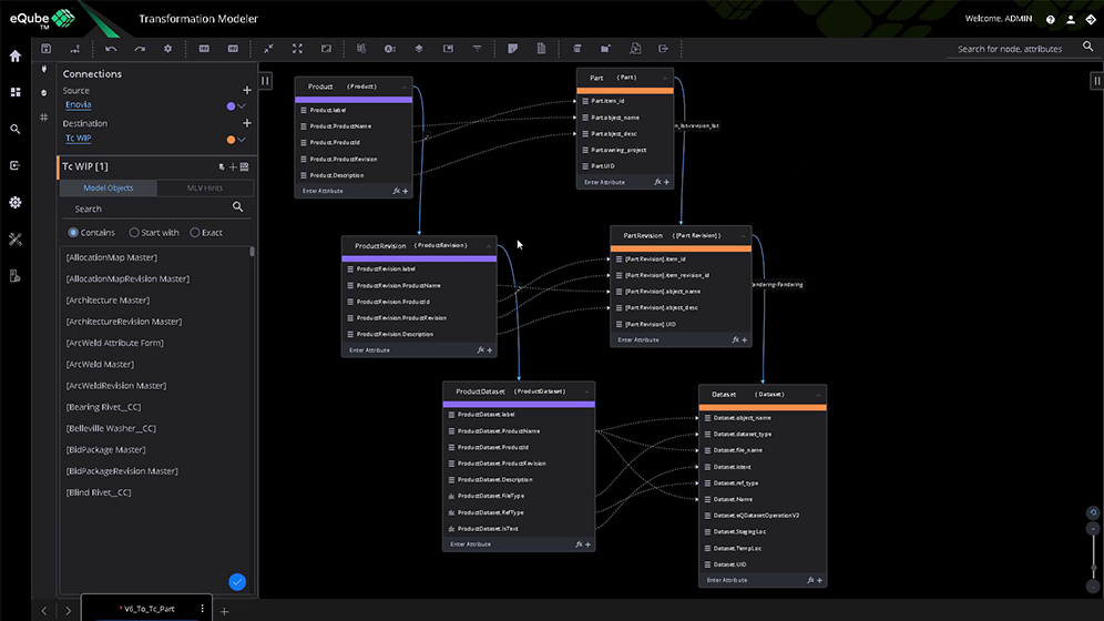
Data Migration to Teamcenter-
from Oracle & Excel
BOM & CAD Migration
from old PLM to new PLM system
Parts, documents & datasets migration -
legacy systems to new PLM system
'For-Purpose' App - data federation
PLM & ERP
Define OData API for new or
old version of Apps
Composite OData API from PLM & CRM
Enterprise Search
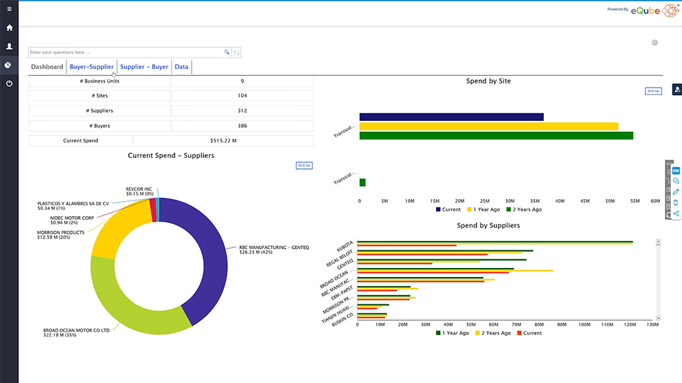
Multi-PLM & ERP - 'For-Purpose' App
with data federation
Consuming pre-built APIs into
composite APIs
MEE capability
Teamcenter Dataset migration
to SAP Document
Que™ Analytics - AI Wiz to build KPIs & Dashboards

eQube®-DaaS Platform - Analytics Suite
eQ Data Science & ML key findings
eQ showcase - Gartner DA Summit 2022
Show Floor Showdown
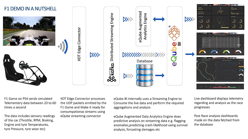
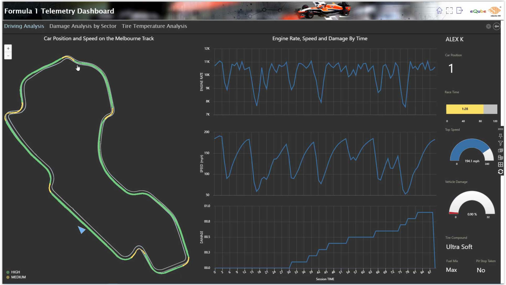
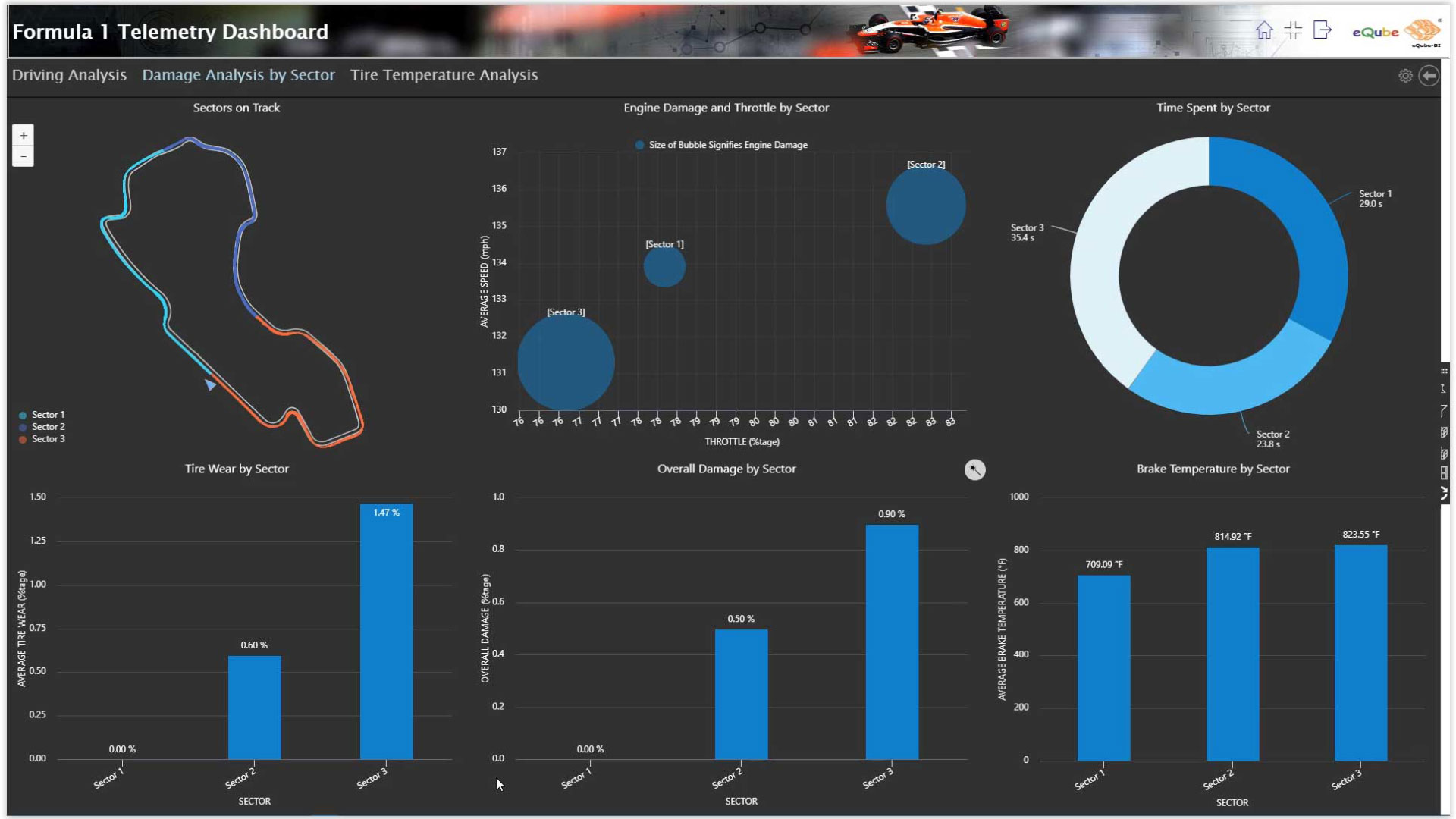
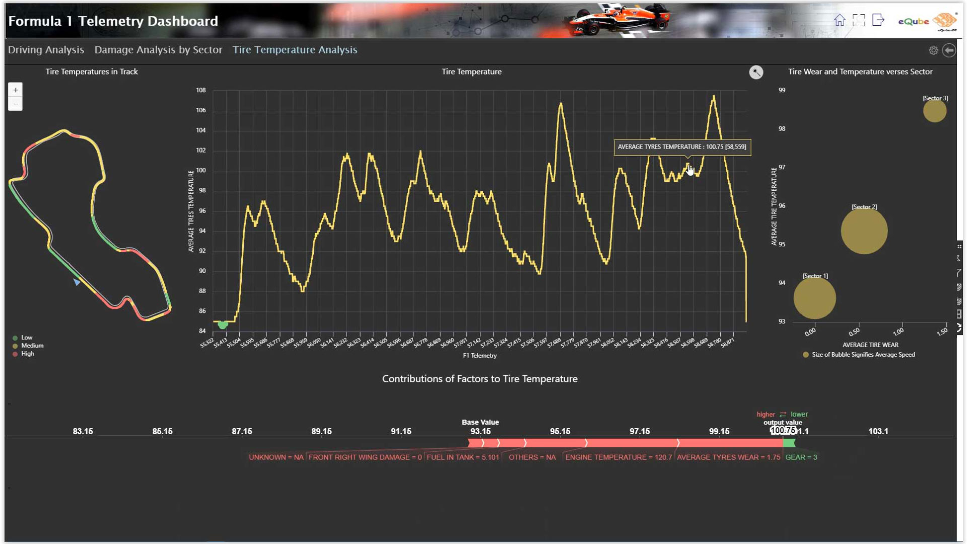
F1 Game Real-time analytics
with sensory data
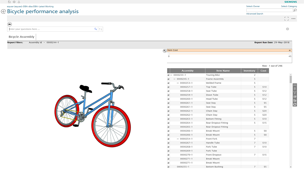
Bicycle performance analysis - tying sensory data with core systems
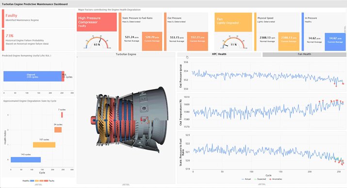
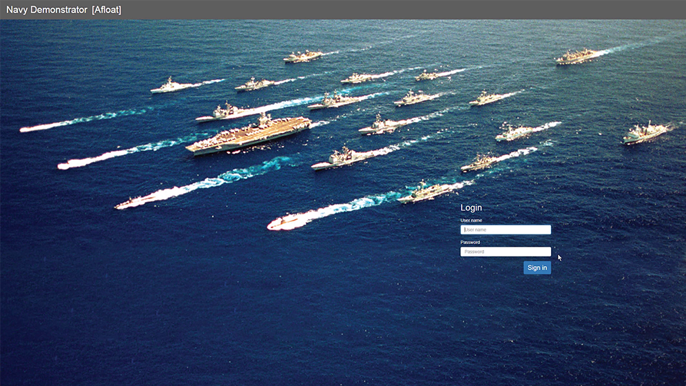
eQube® App - Navy demo with predictive maintenance
Bigdata processing and
reporting - Airline data
eQube®-BI building blocks
Navigation in eQube®-BI
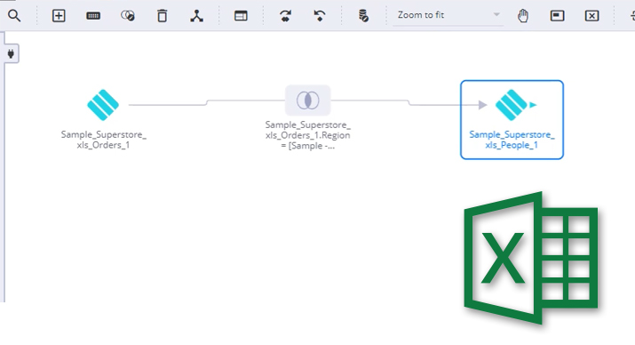
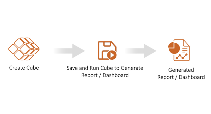
Create basic cube and report from excel
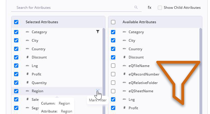
Add filters to reports
Create a Dashboard
eQube®-MI UI tour
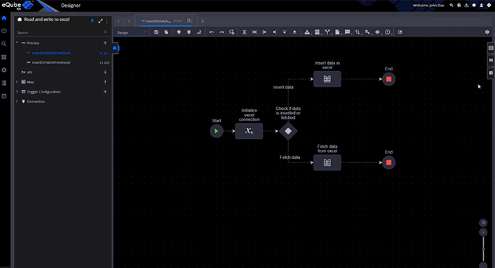
How to create a Process?
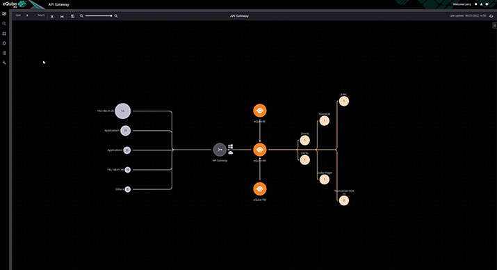
eQube®-AG UI tour
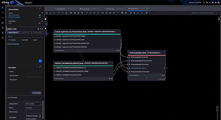
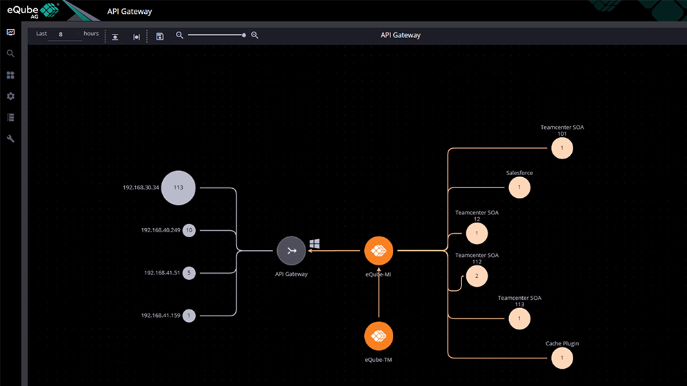
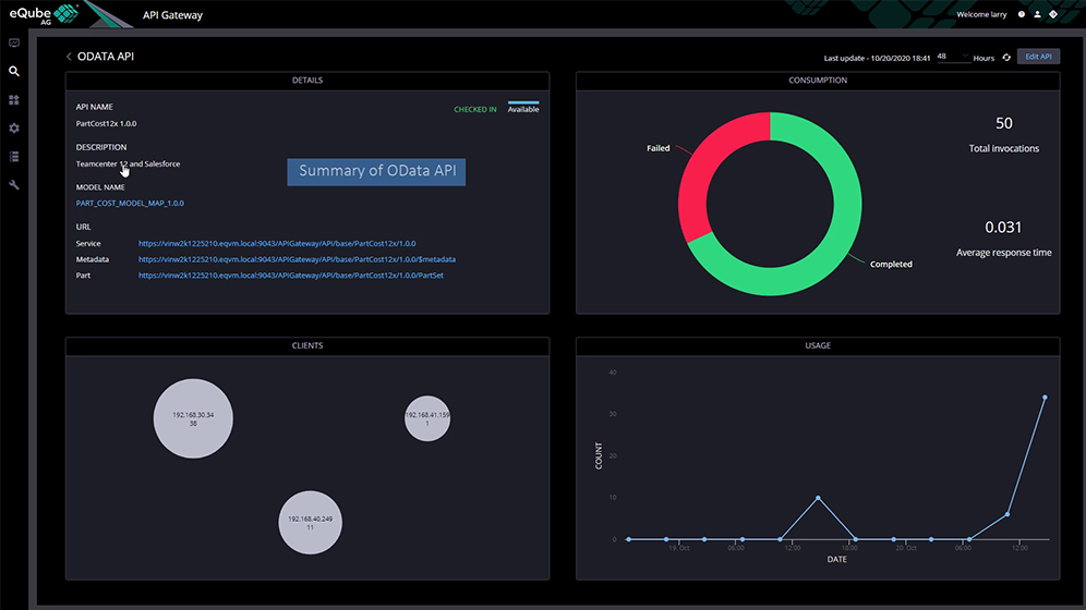
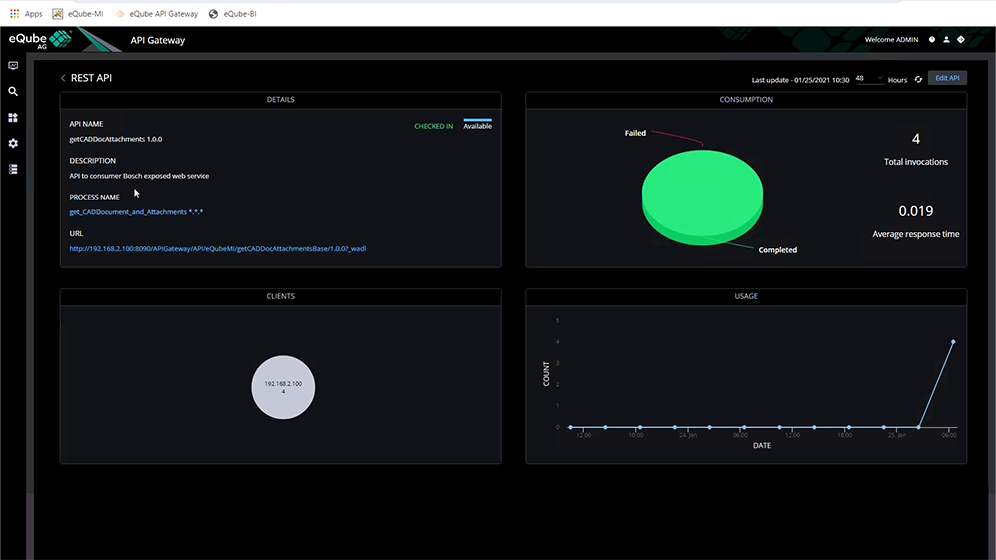
REST API to federate data from multiple data sources
eQube®-TM tour
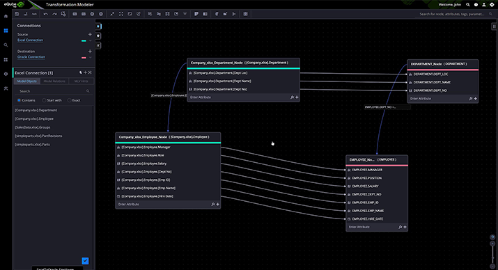
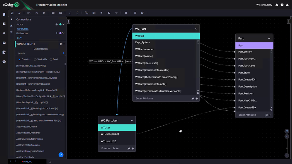
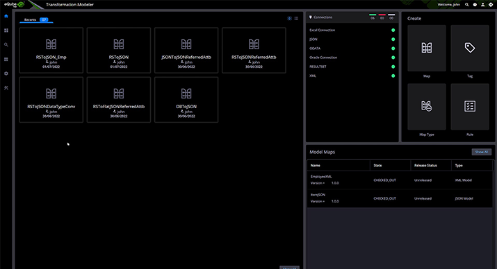
How to create a Map in eQube®-TM
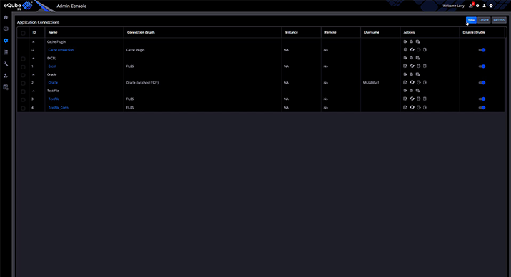
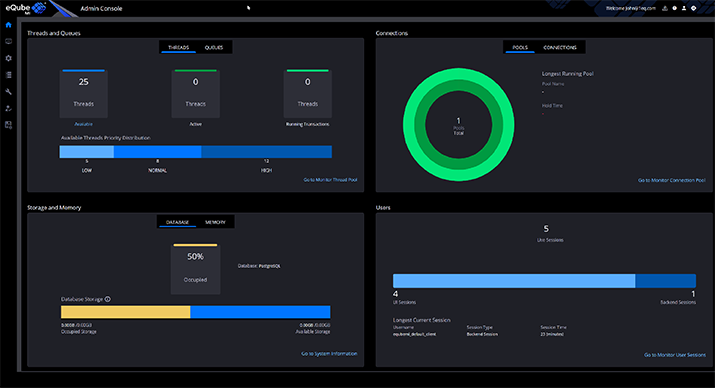
Admin Console Capabilities - Part 1
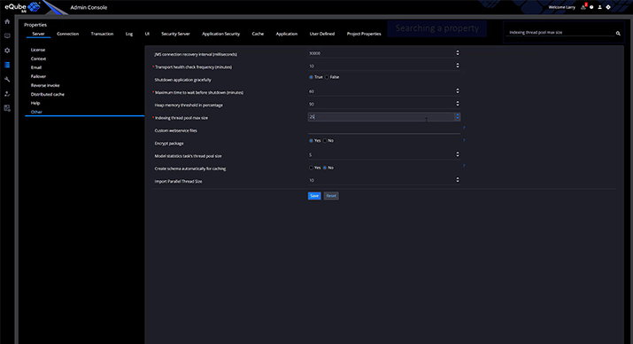
Admin Console Capabilities - Part 2
eQube®-BI Dashboard Visualization
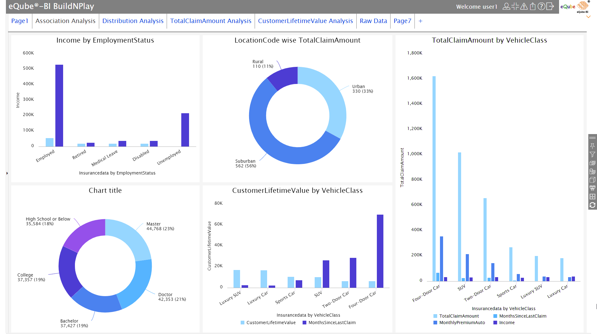

Insurance analysis dashboard

Insurance analysis dashboard
Interesting insights about the data automatically discovered by eQube®-ADA, presented intuitively
Enlarge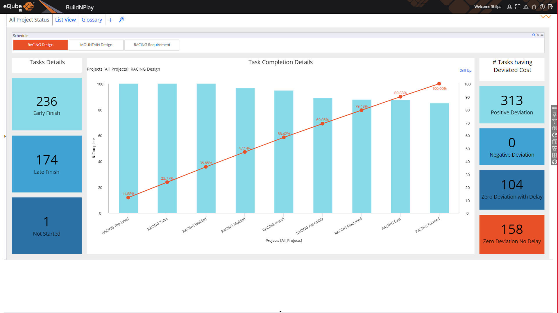
Project status dashboard
Project status dashboard
Progress of all tasks in a project. Tasks not started, finished early or finished late shown along with the cost deviation
Enlarge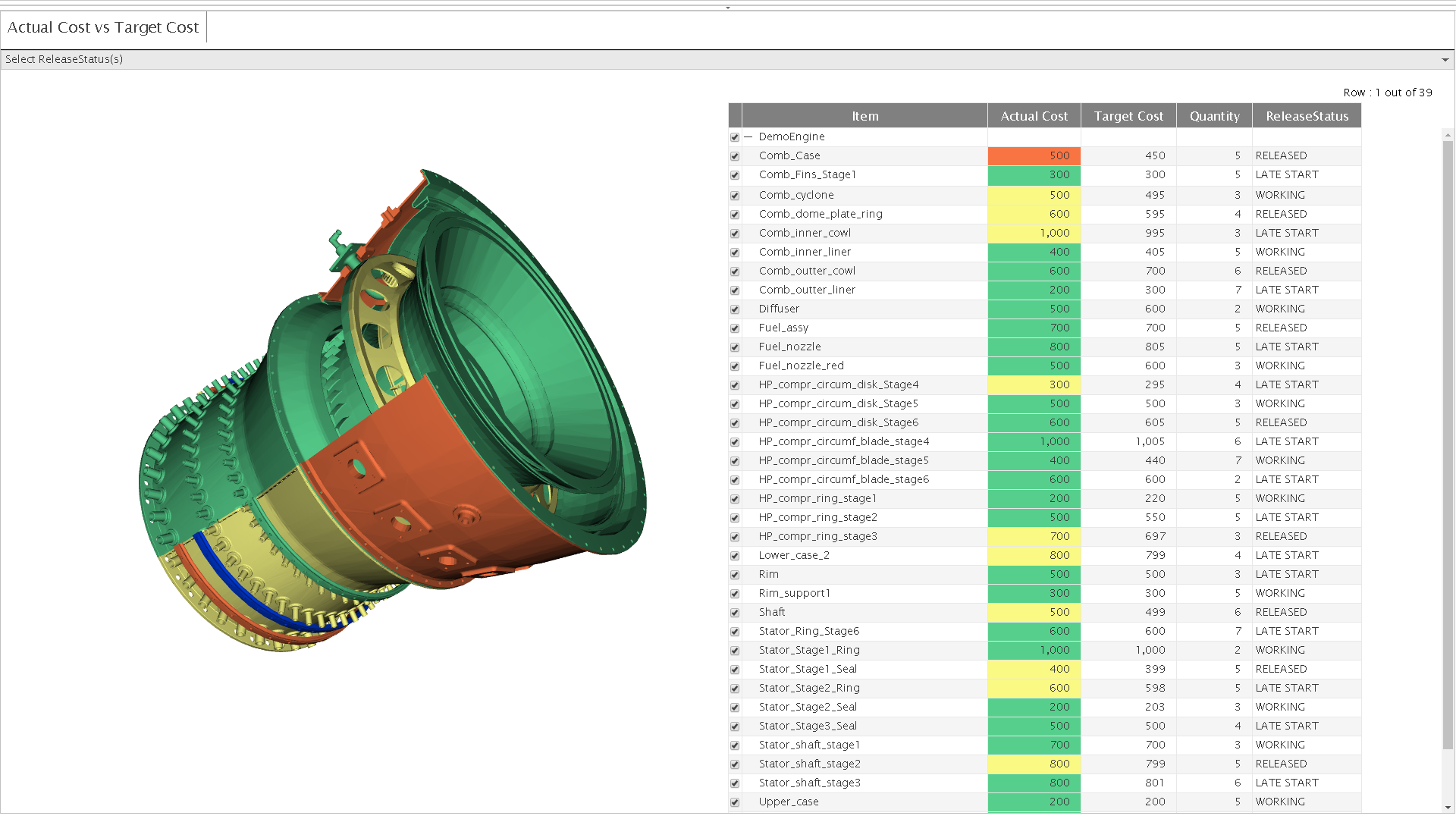
3D insight module
3D insight module
3D geometry in the report- Colors on the jet engine indicate different cost thresholds.
Enlarge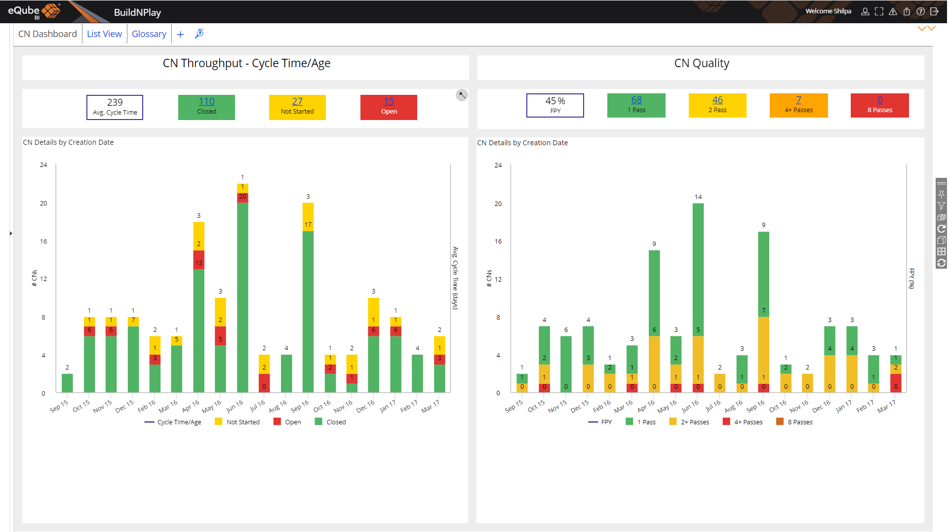
Change notice dashboard
Change notice dashboard
Key metrics such as quality and throughput / cycle time of changes -valuable insight into change process.
Enlarge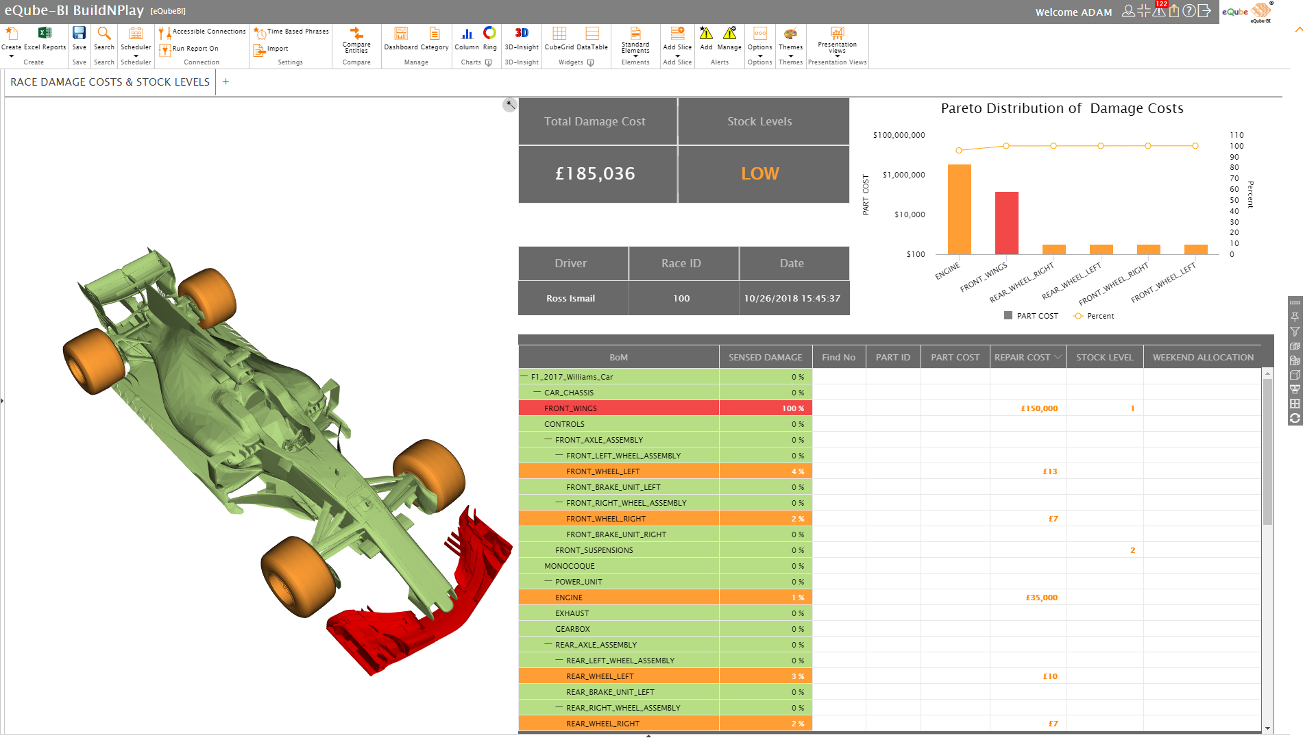
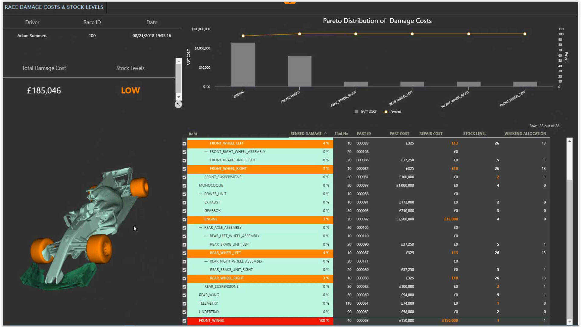
Race damage costs and stock levels
Race damage costs and stock levels
3D image of a racing car showing damage along with the BOM of the car & spares stock levels with total cost of the damage
Enlarge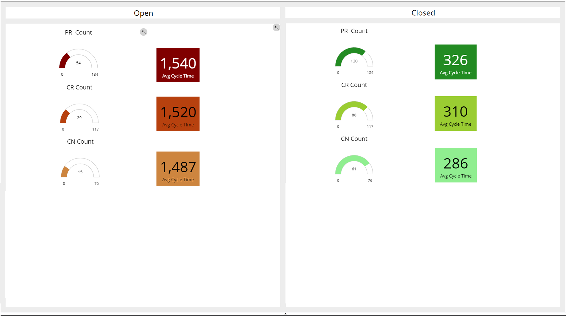
Open Vs Closed status of PRs, CRs & CNs
Open Vs Closed status of PRs, CRs & CNs
Single view of open and closed PRs, CRs, and CNs. Shows average cycle which measures the efficiency of diff. teams
Enlarge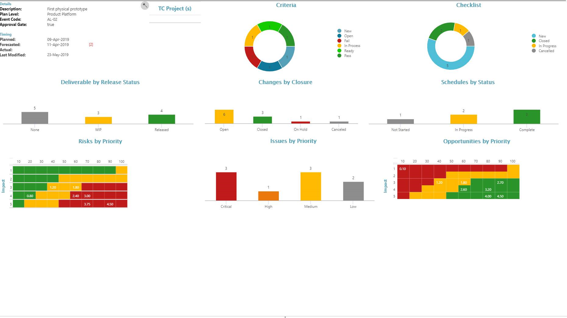
Project/Program planning dashboard
Project/Program planning dashboard
Health and status of a Program. Deliverables, changes, schedules, risks, issues and opportunities all on a single dashboard
Enlarge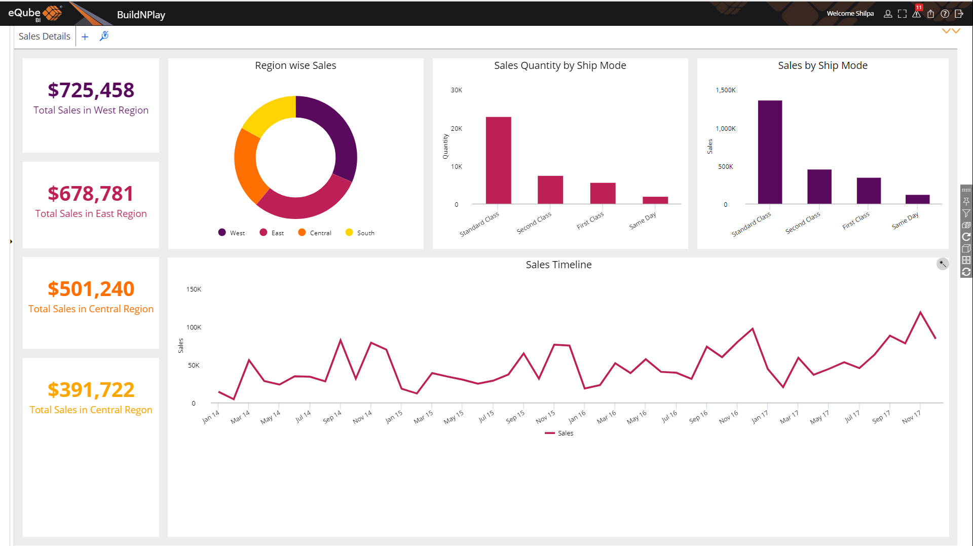
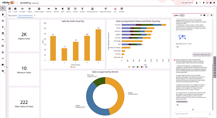
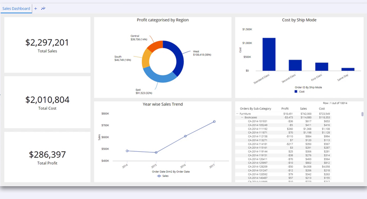
Sales dashboard
Sales dashboard
Insightful information of sales analysis for each region. Shows sales trend over the months.
Enlarge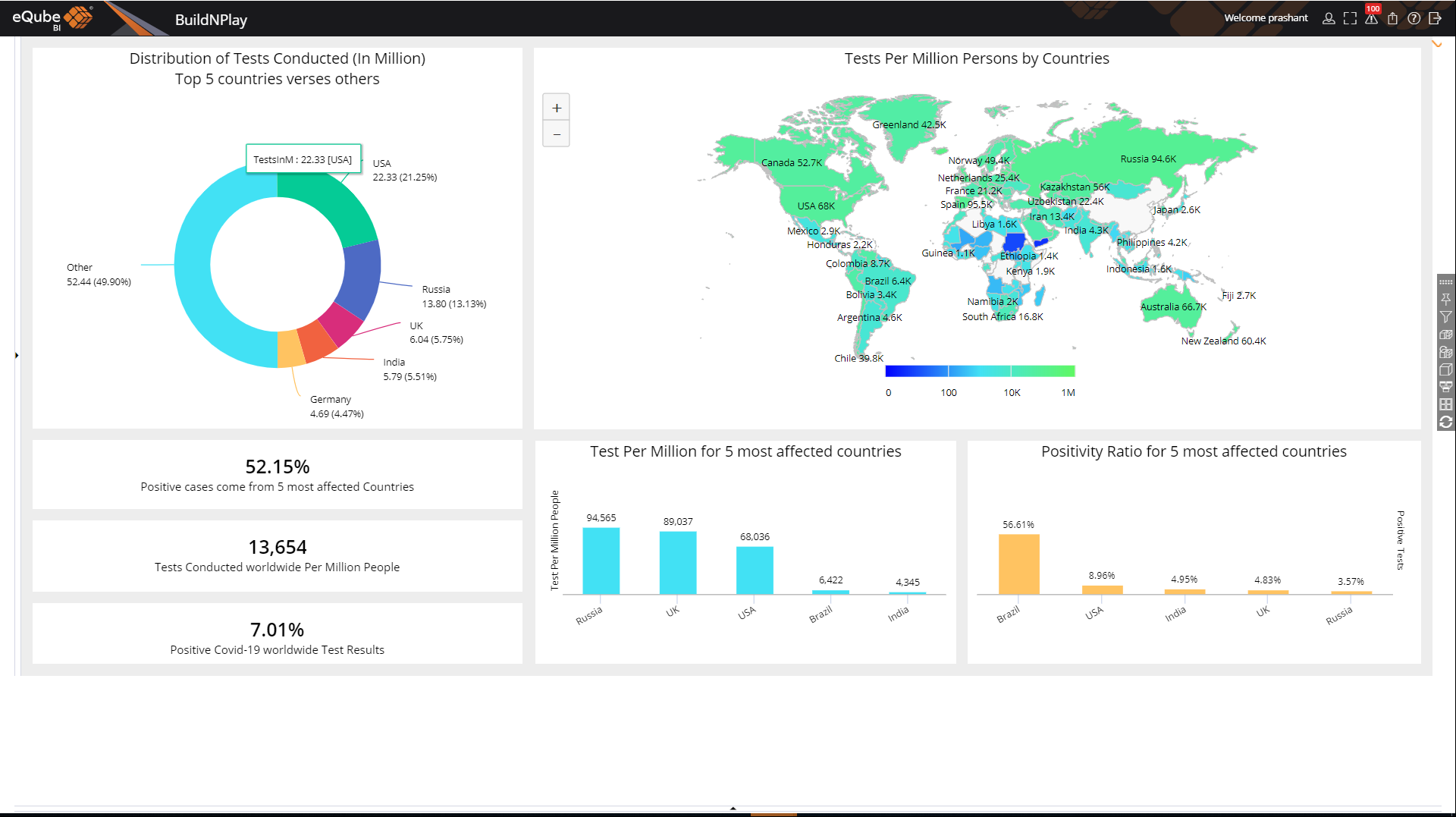
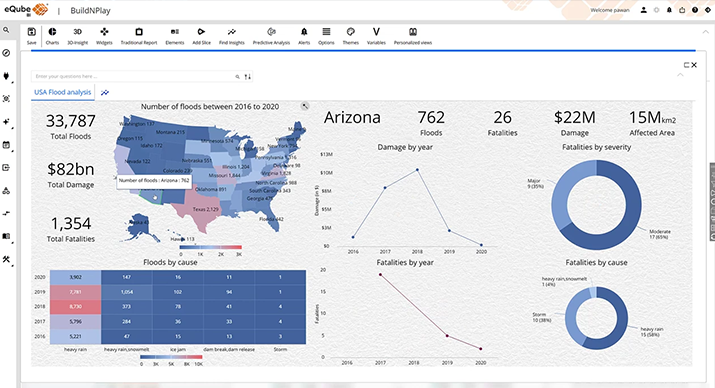
Covid-19 testing analysis
Covid-19 testing analysis
Overview of the Covid-19 tests conducted across the world. Shows tests conducted by diff. countries.
Enlarge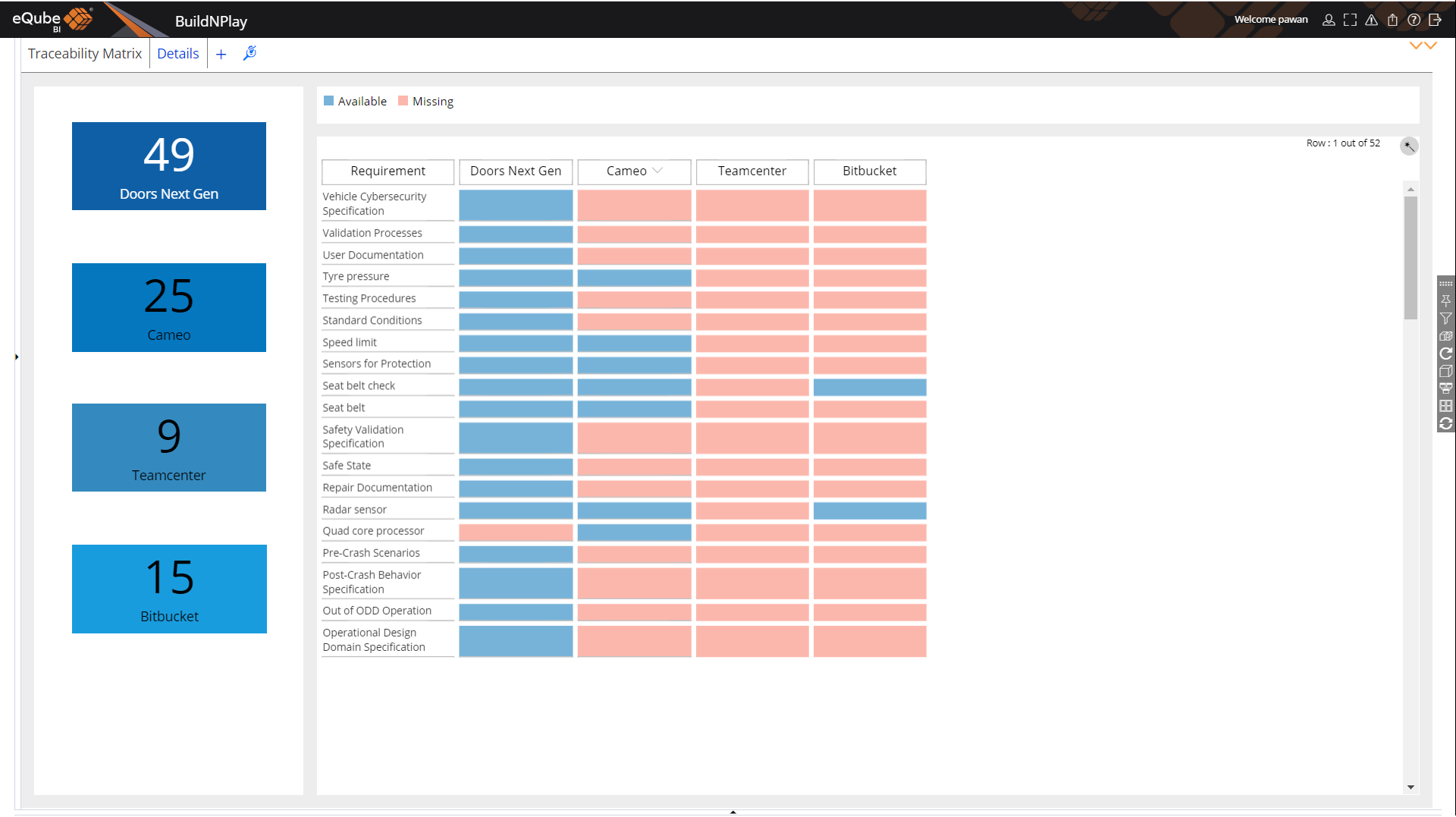
Requirement traceability report
Requirement traceability report
End-to-end traceability of Requirements & other artifacts in 4 diff. systems. Identifies missing artifacts in each of the system at a glance.
Enlarge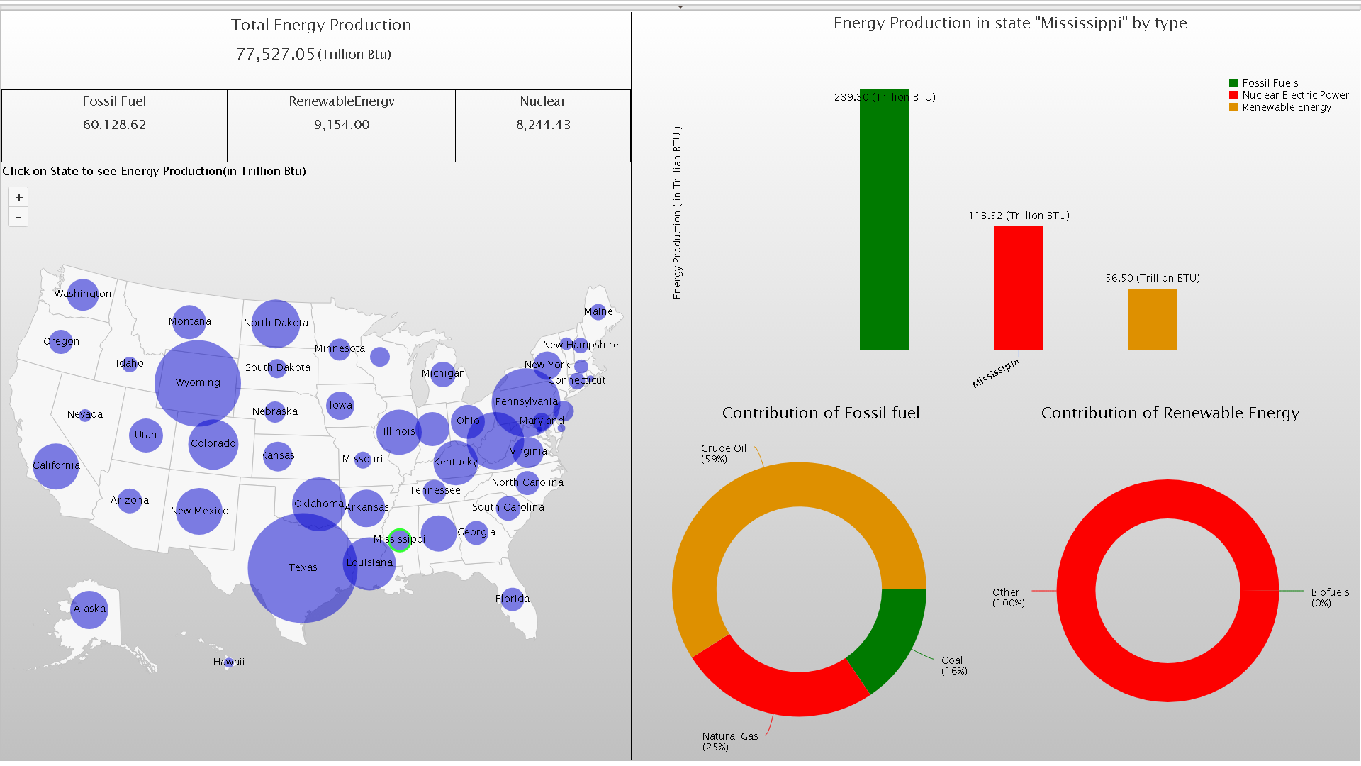
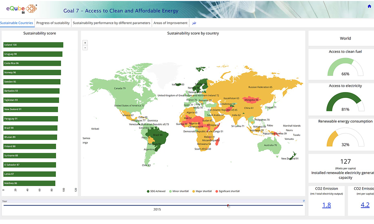
Energy production
Energy production
Energy produced by each state in USA. Energy production in Mississippi by fuel type; Breakup of fossil fuel & renewable energy
Enlarge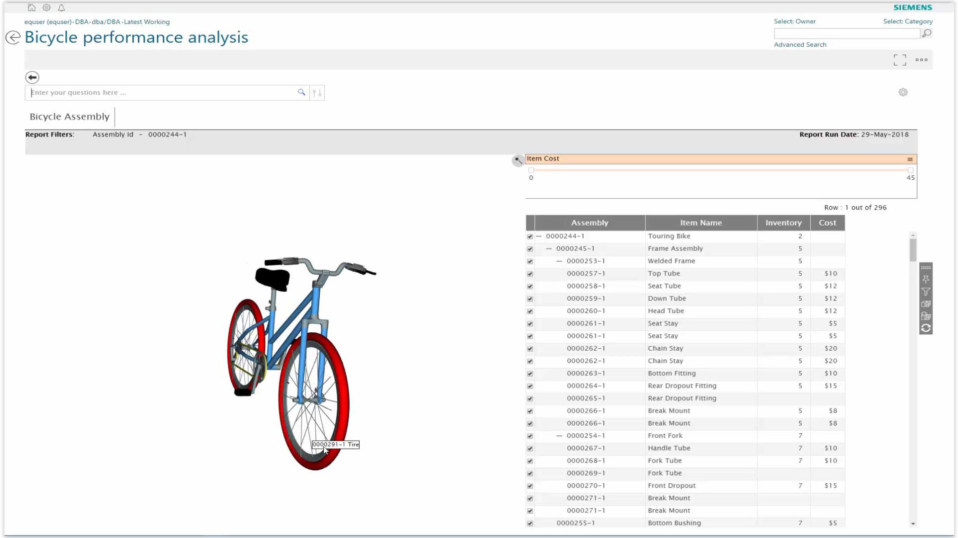
Performance analysis
Performance analysis
Bicycle performance analysis using sensor data – Sensor data mash up with BOM in Teamcenter
Enlarge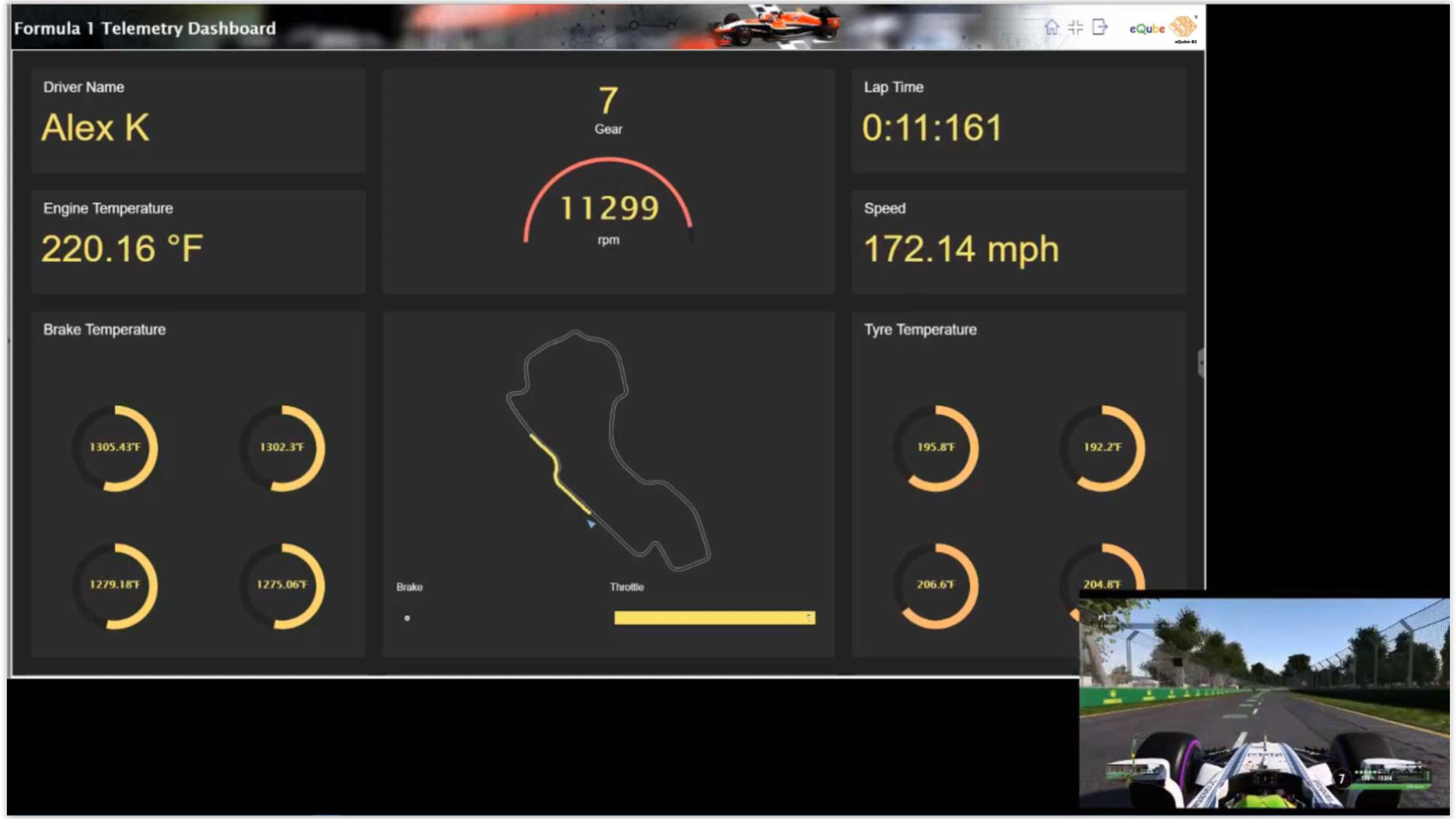
eQube®-BI live dashboard
eQube®-BI live dashboard
Live simulated telemetry information is used as the race progresses.
Enlarge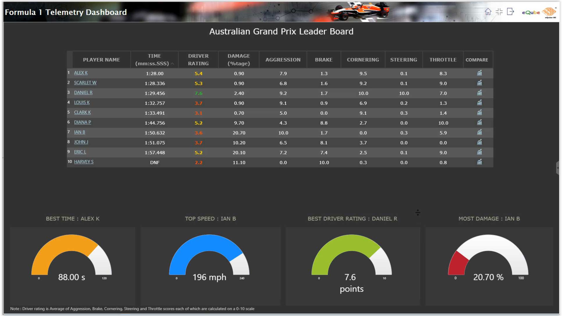
Leader board report
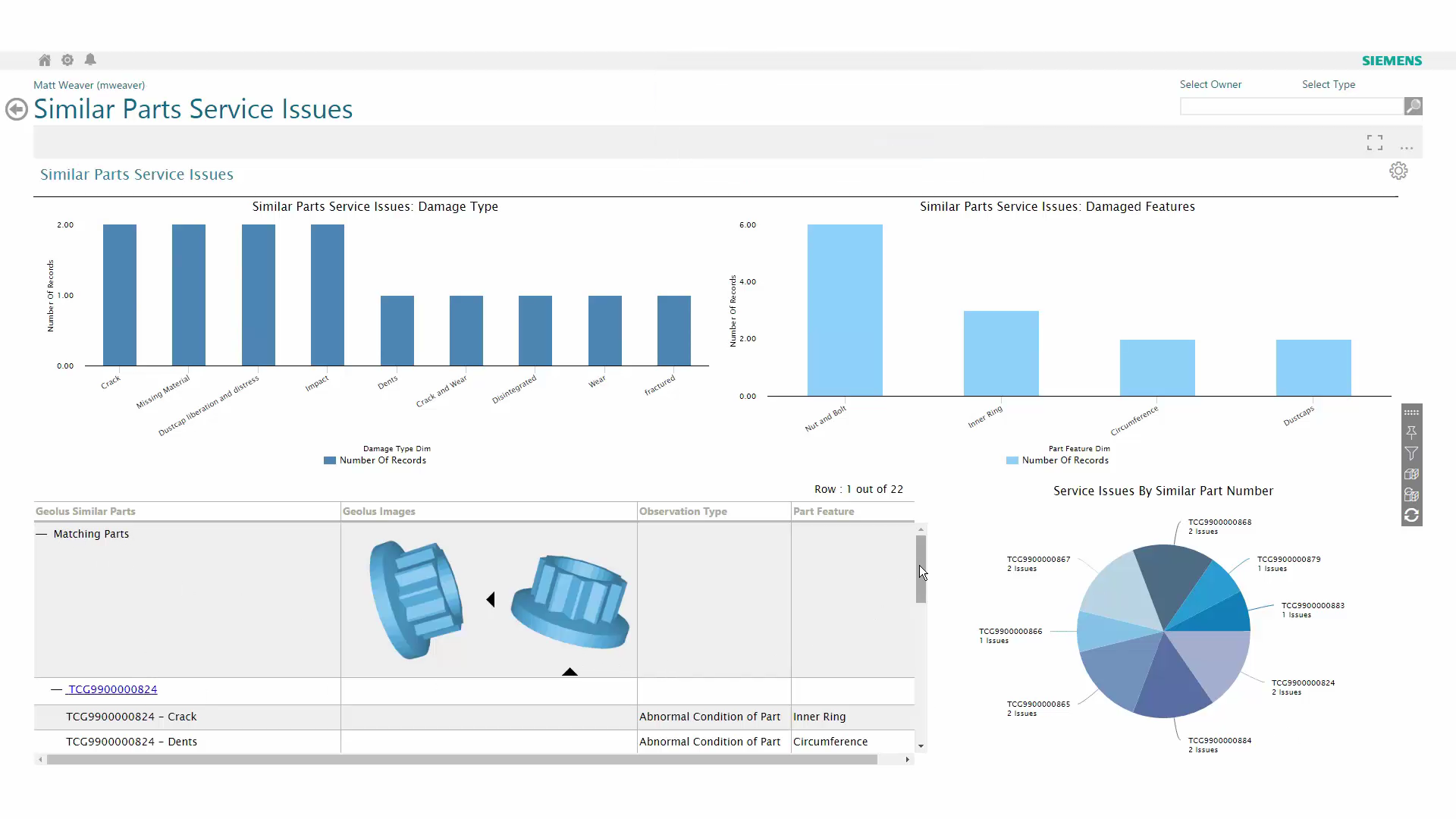
Geolus shape search capability
Geolus shape search capability
Similar shapes are searched; Additional information from SAP & TeamCenter is shown in AWC
Enlarge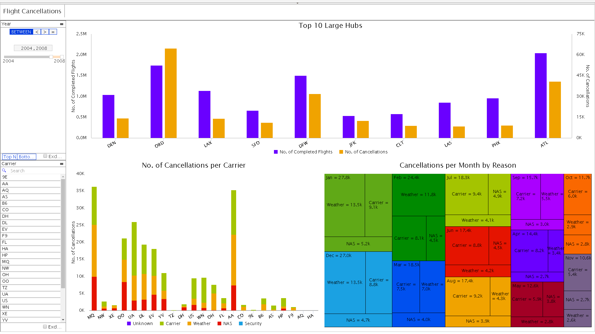
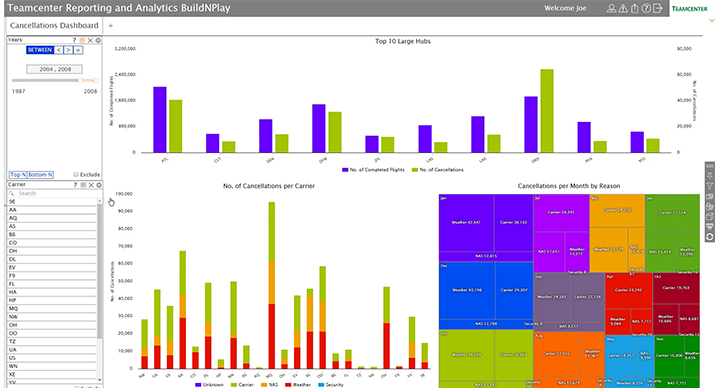
Flight cancellation dashboard
Flight cancellation dashboard
Completed flights and cancelled flights for top 10 hubs along with flight cancellations breakup
Enlarge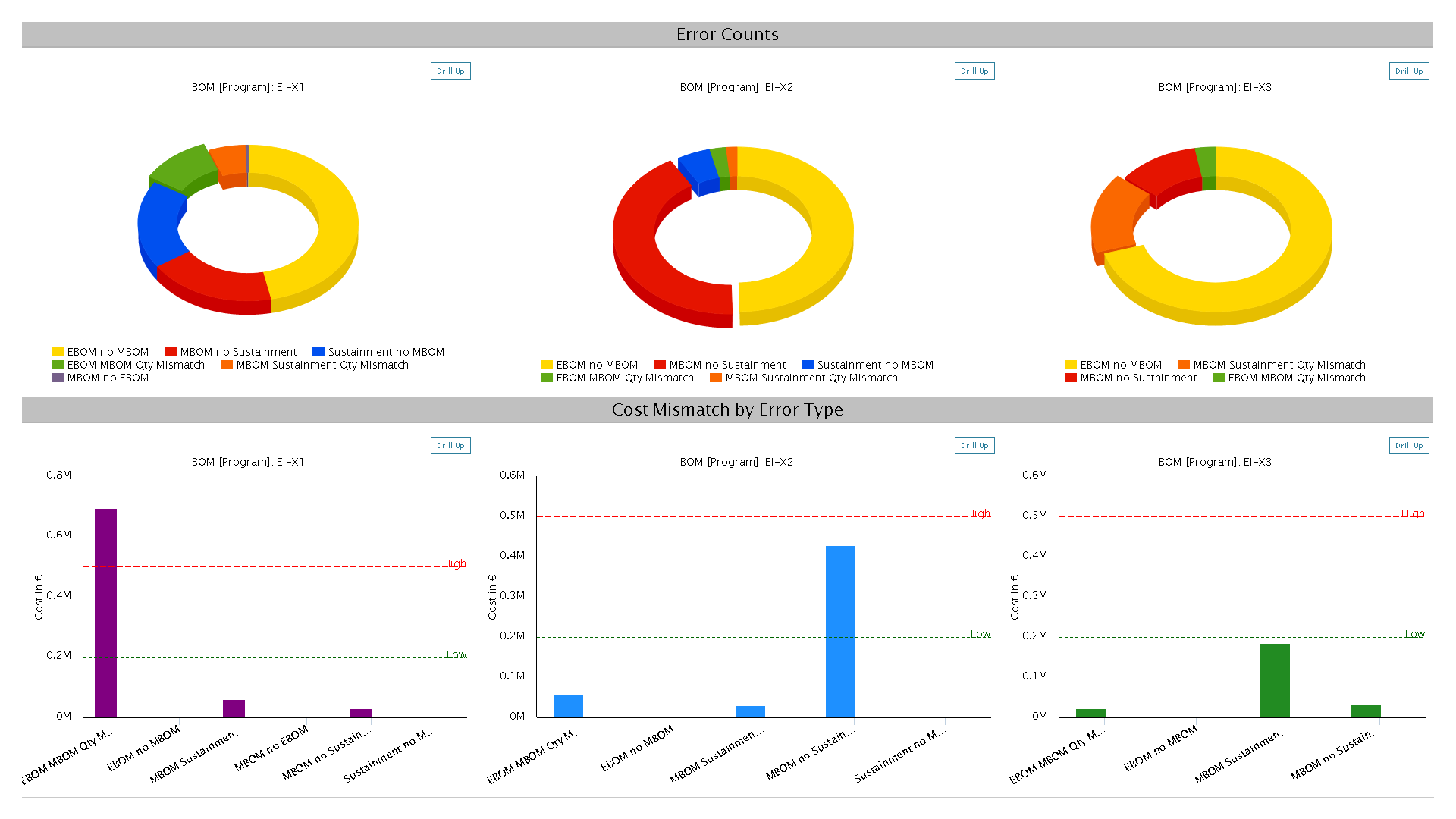
Comparison of eBoM and MBoM
Comparison of eBoM and MBoM
eBoM - mBoM & sustainment BoM comparison fetched Teamcenter and SAP, and Oracle respectively
Enlarge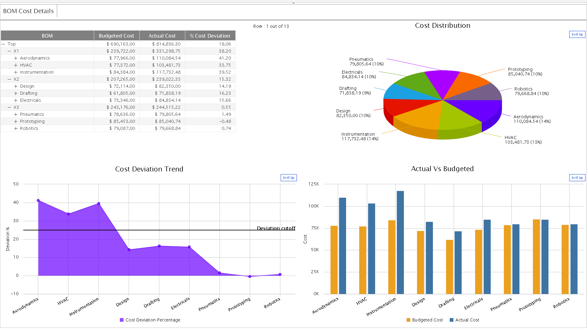
Cost deviation trend report
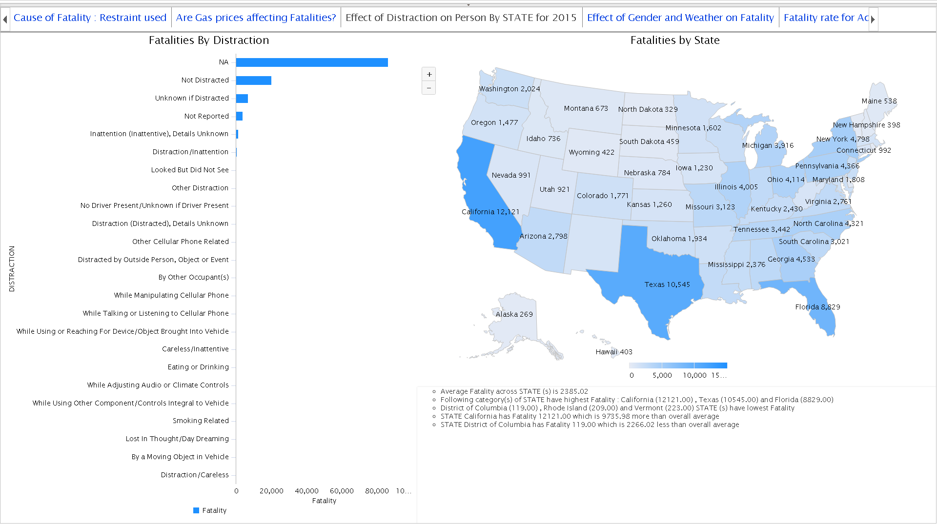
Accident fatalities by state
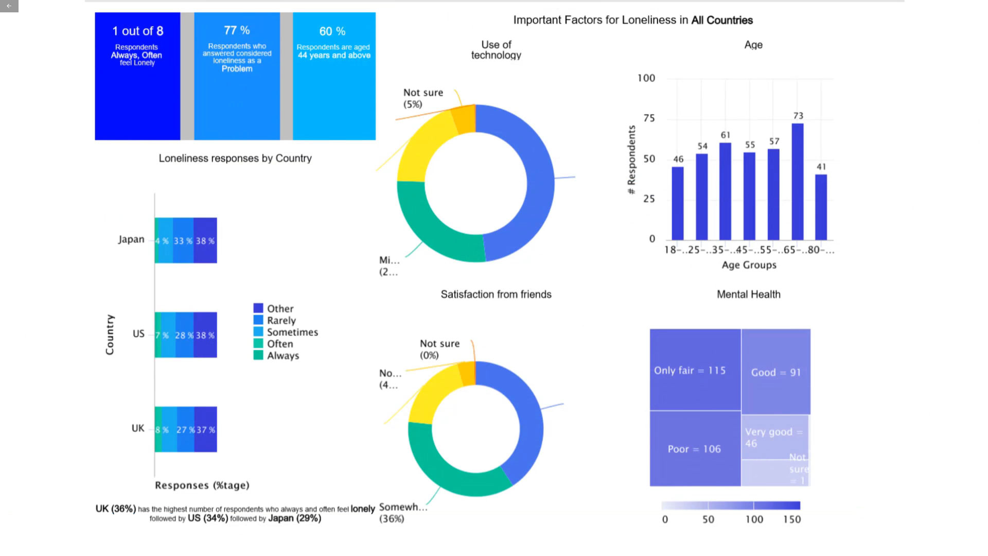
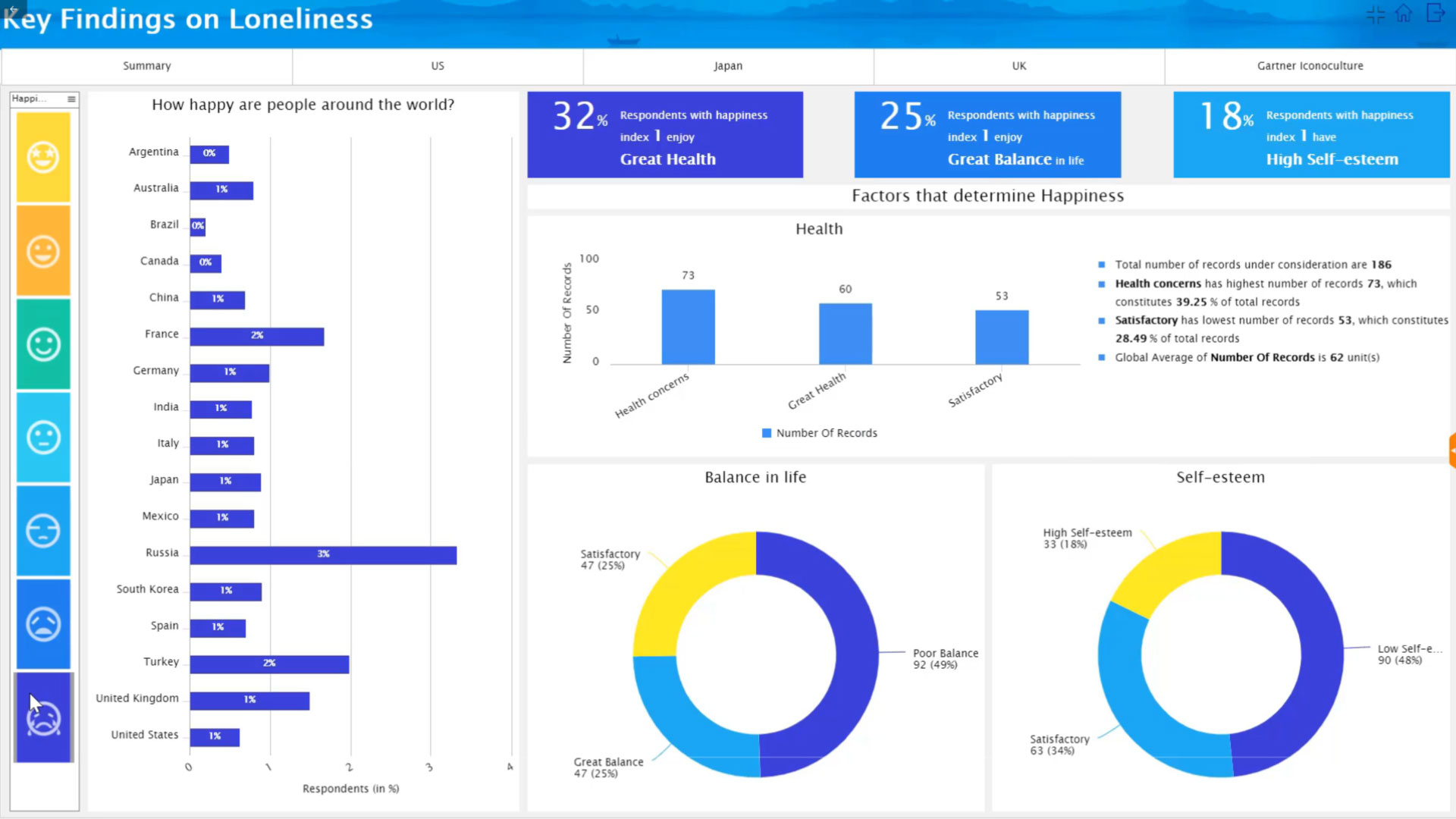
Factors influencing loneliness
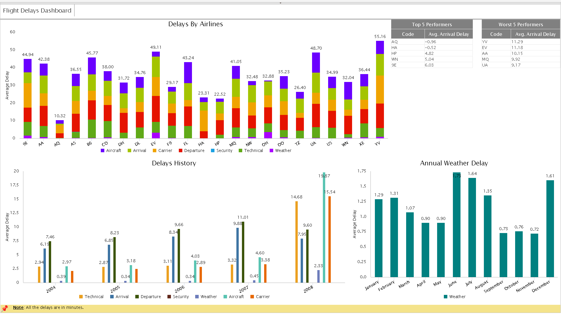
Airline Delays Dashboard
Airline Delays Dashboard
Delays shown by airline, history, and delays caused by weather annually. Top & worst performers shown
Enlarge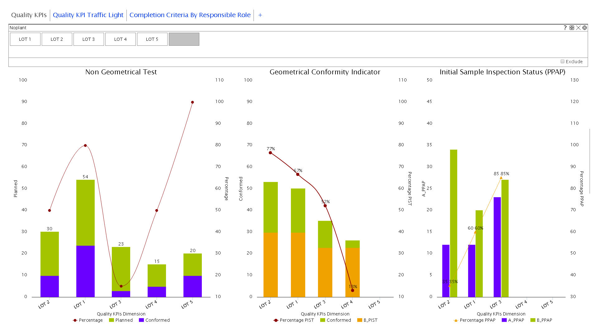
Geometric conformance and PPAP
Geometric conformance and PPAP
Dashboard showing non-geometrical conformance & PPAP (Production Part Approval Process)
Enlarge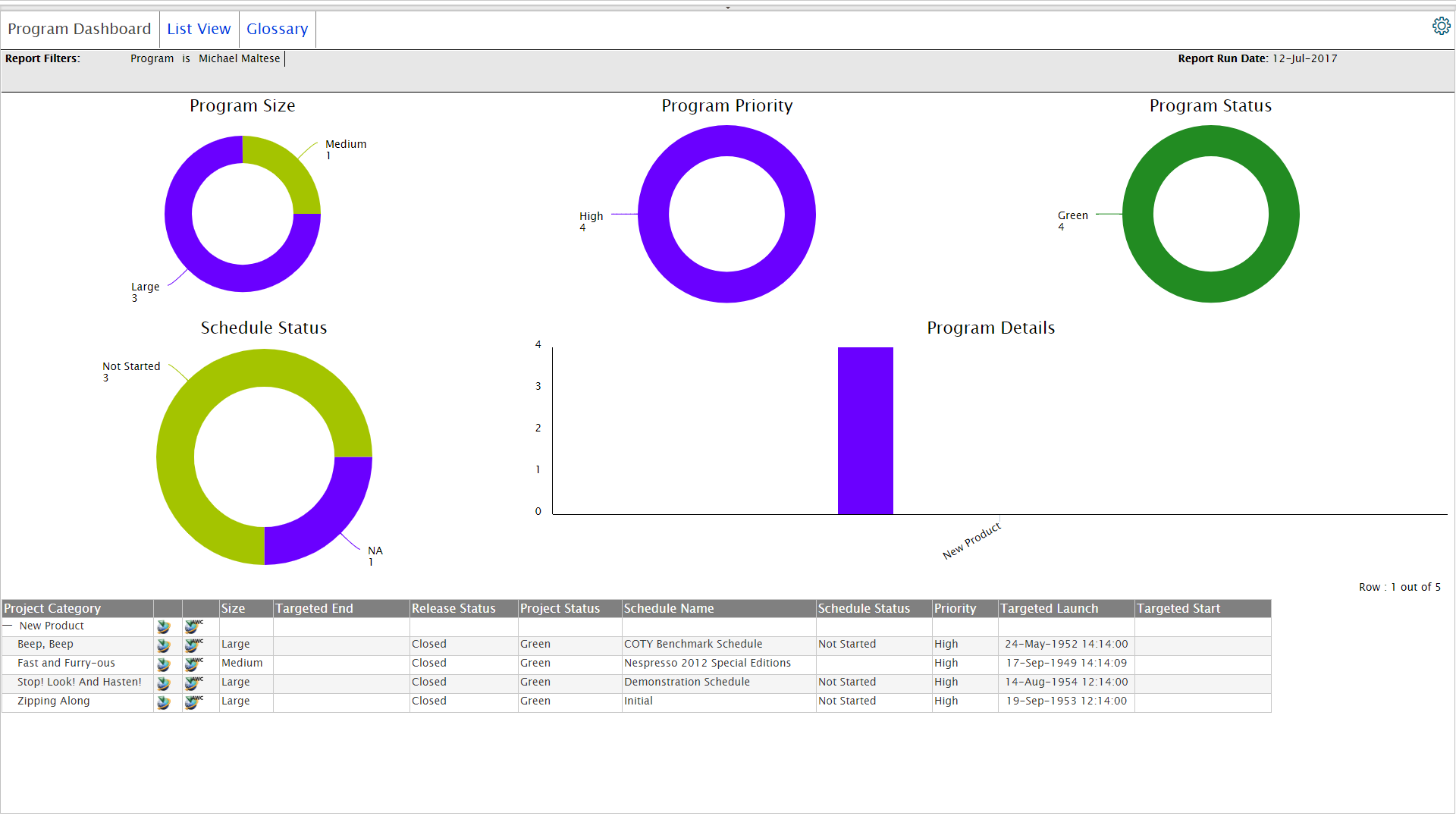
Program Dashboard
Program Dashboard
Program overview:- status of program schedule - started, not started, delayed, along with program priority
Enlarge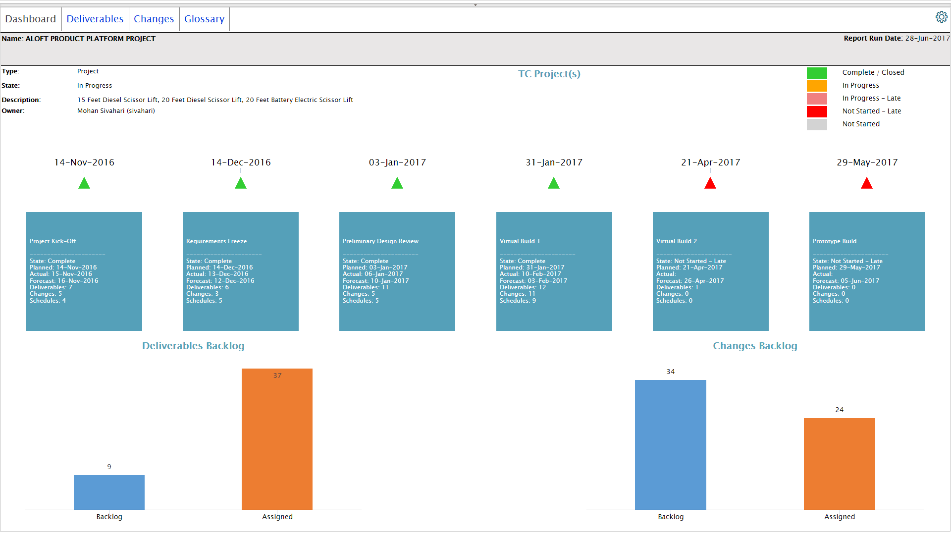
Project Cockpit - Monthly Status
Project Cockpit - Monthly Status
Project Cockpit - breakup of different project deliverables and backlogs
Enlarge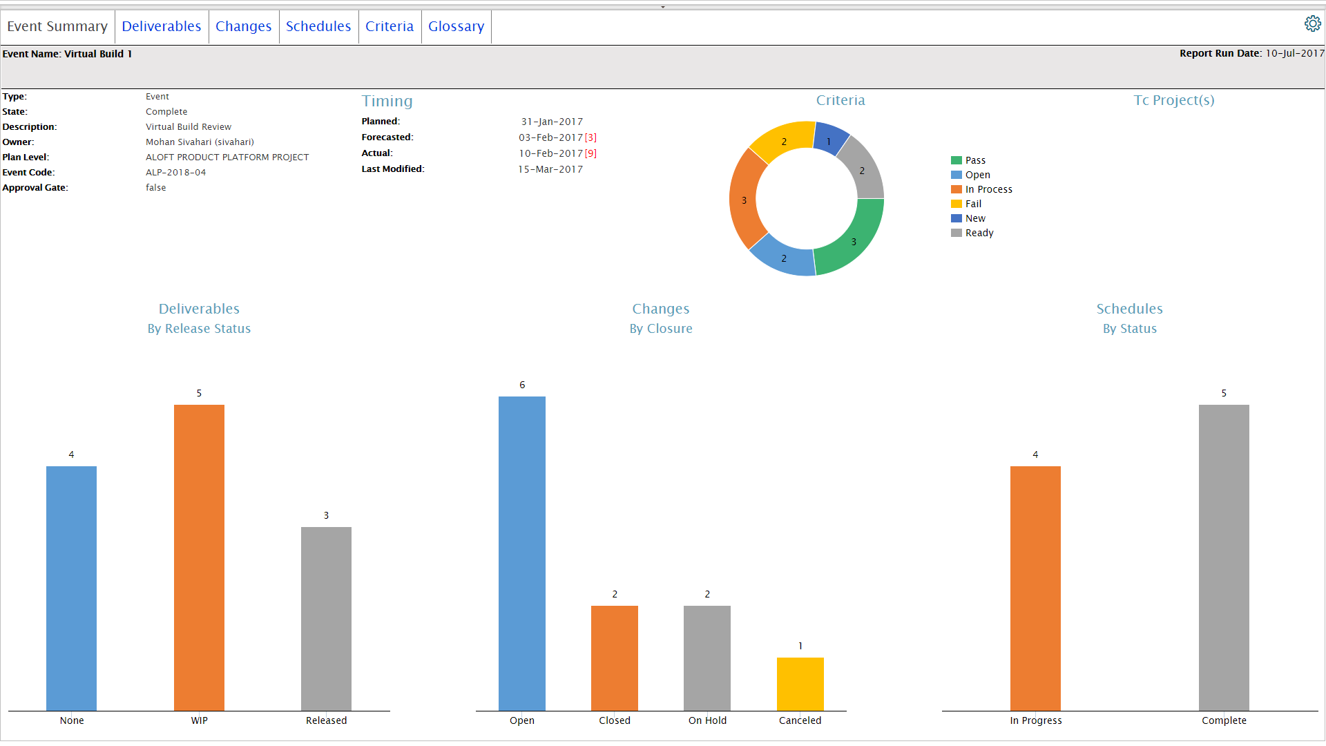
Requirement dashboard
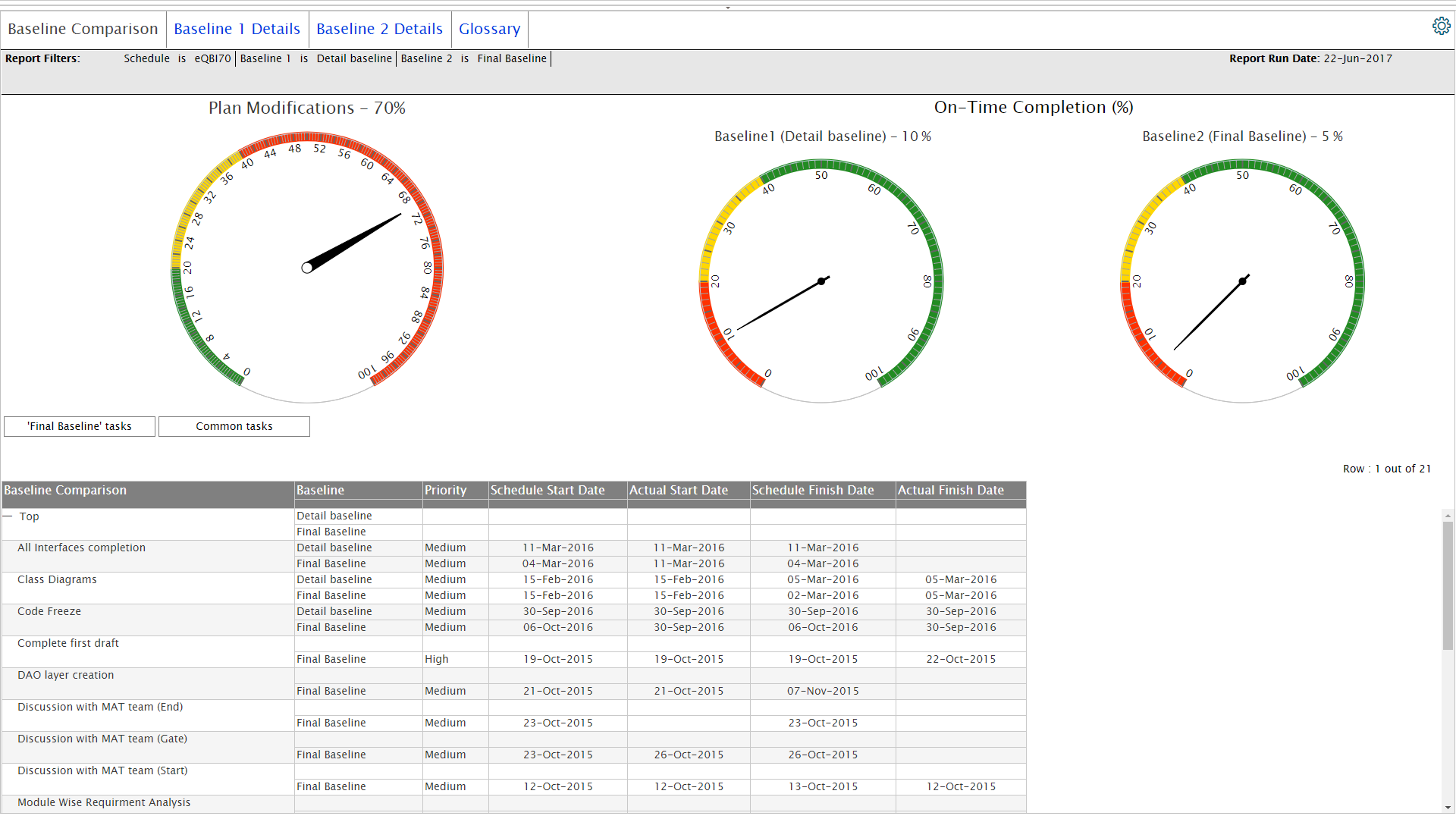
Schedule baseline comparison
Schedule baseline comparison
Comparison of two project baselines showing the on time % completion of tasks.
Enlarge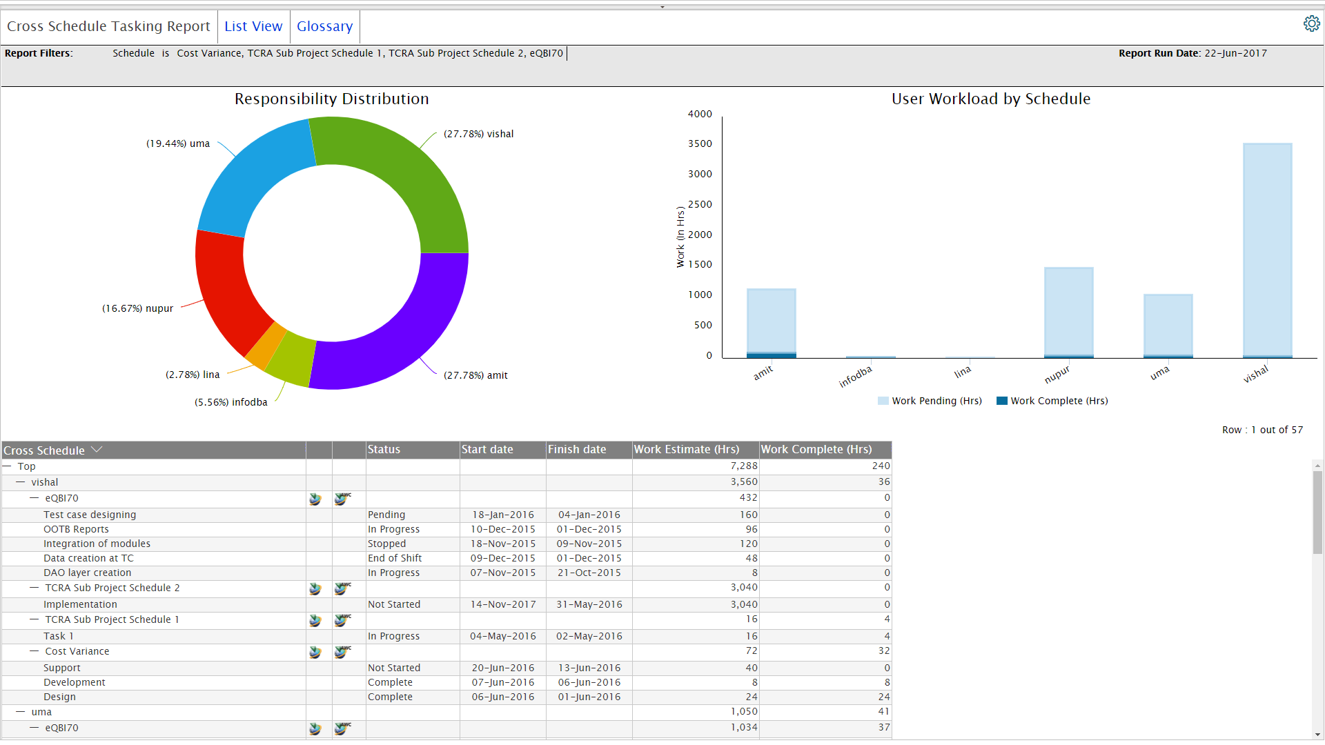
Cross schedule tasking report
Cross schedule tasking report
Workload and its status for each user across multiple schedules across diff. projects. Identifies bottlenecks
Enlarge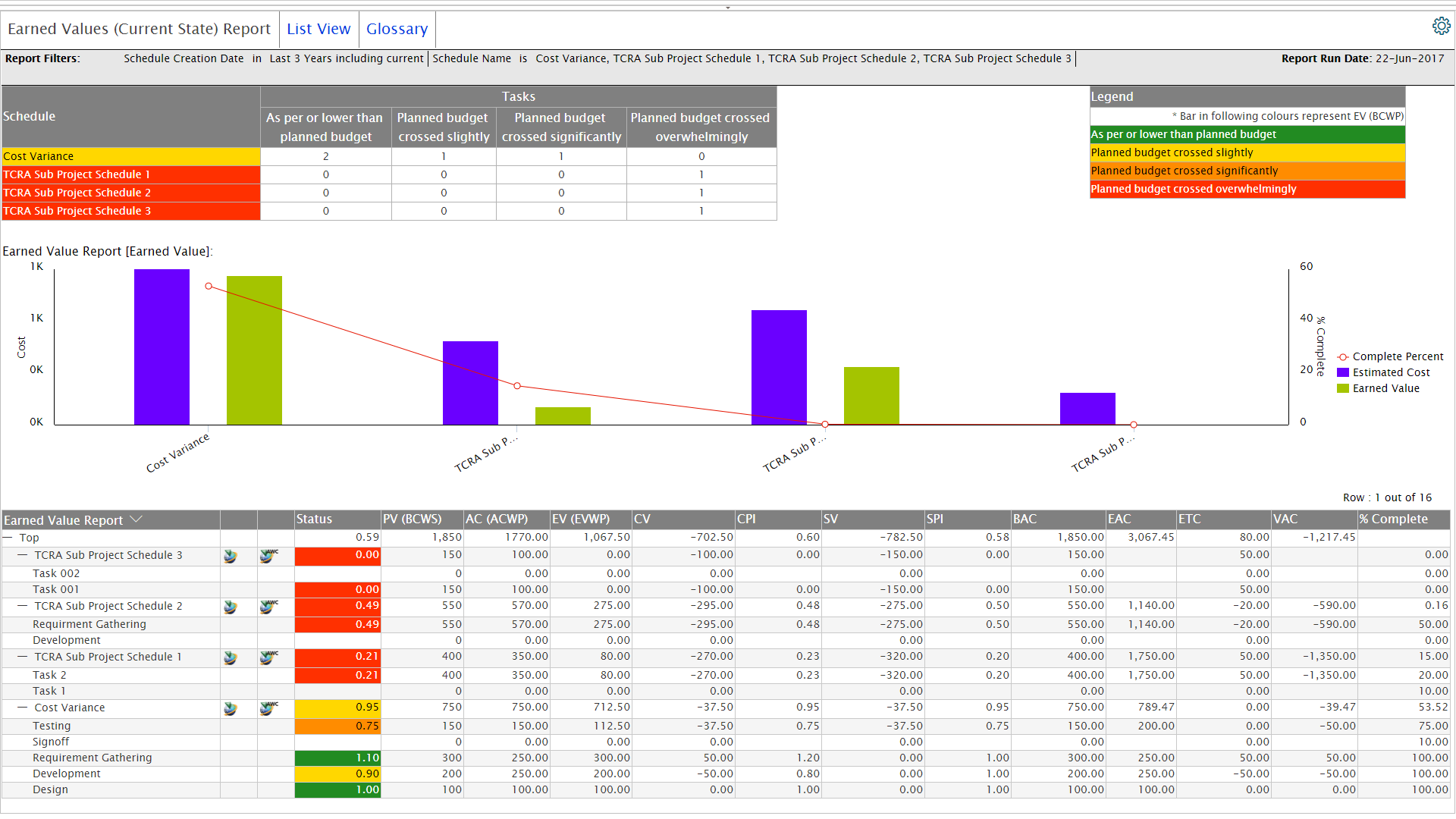
Earned values report
Earned values report
Earned Value Analysis of schedules for current date. Project hours and cost performance is shown
Enlarge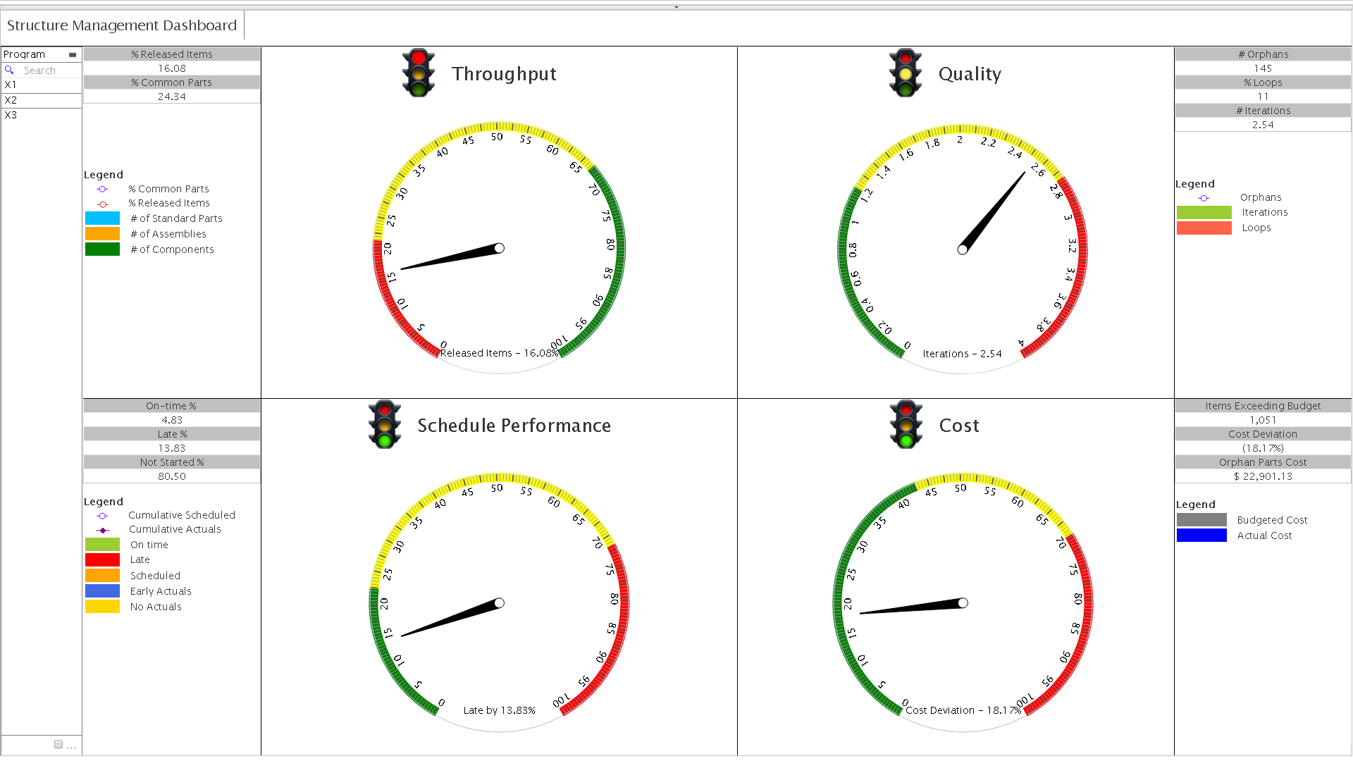
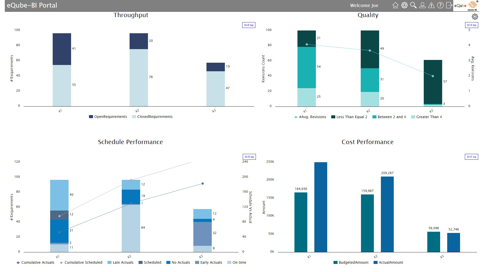
Structure management dashboard
Structure management dashboard
Throughput, quality, schedule and cost performance for product development.
Enlarge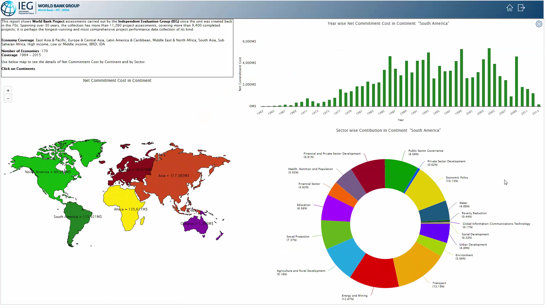
World bank independent evaluation
World bank independent evaluation
30 year project assessment – continent-wise commitment & sector wise contribution.
Enlarge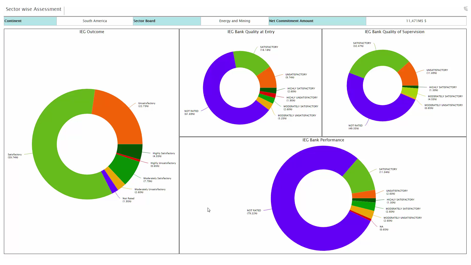
World bank evaluation - Sector-wise assessment
World bank evaluation - Sector-wise assessment
Sector-wise assessment – Bank quality, Bank Quality of supervision, Bank performance.
Enlarge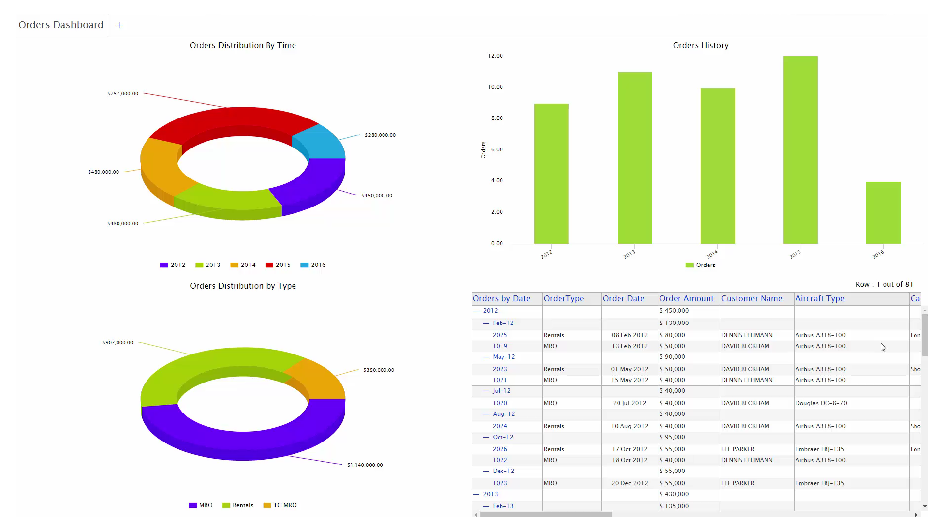
Orders dashboard
Orders dashboard
Multisystem report for aircraft rental data from Excel, sales orders from SAP, MRO orders from Oracle, as well as Teamcenter.
Enlarge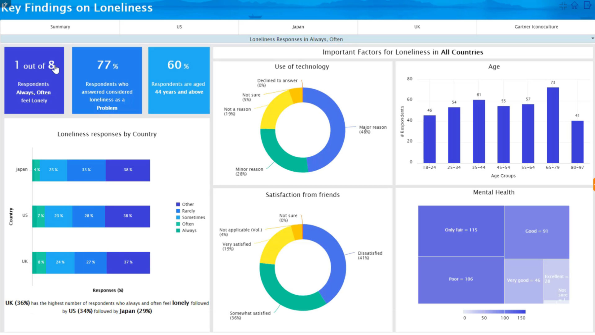
Loneliness factor analysis
Loneliness factor analysis
Analysis of factors contributing to loneliness in people across all countries.
Enlarge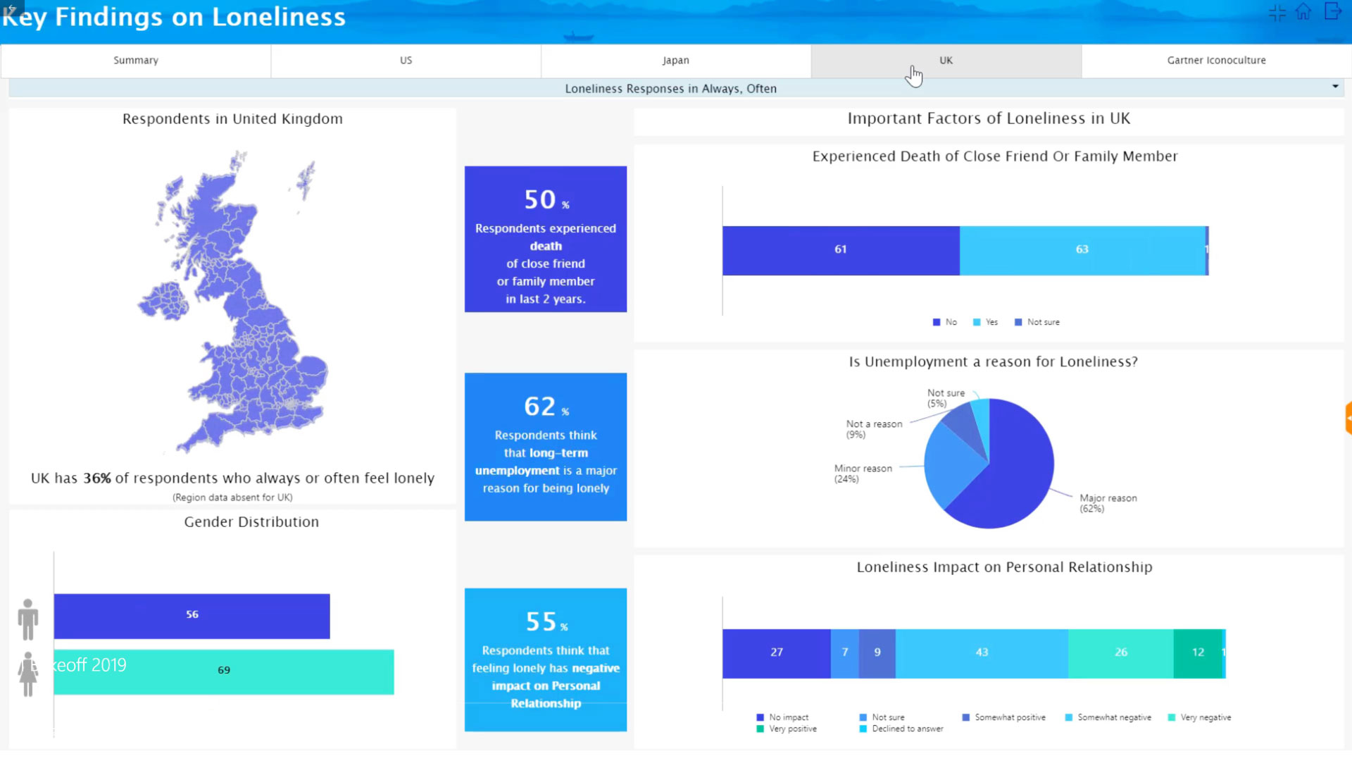
State wise analysis